UW Medicine
Provider + Clinic Contextual Appointing Modal
Business Goal
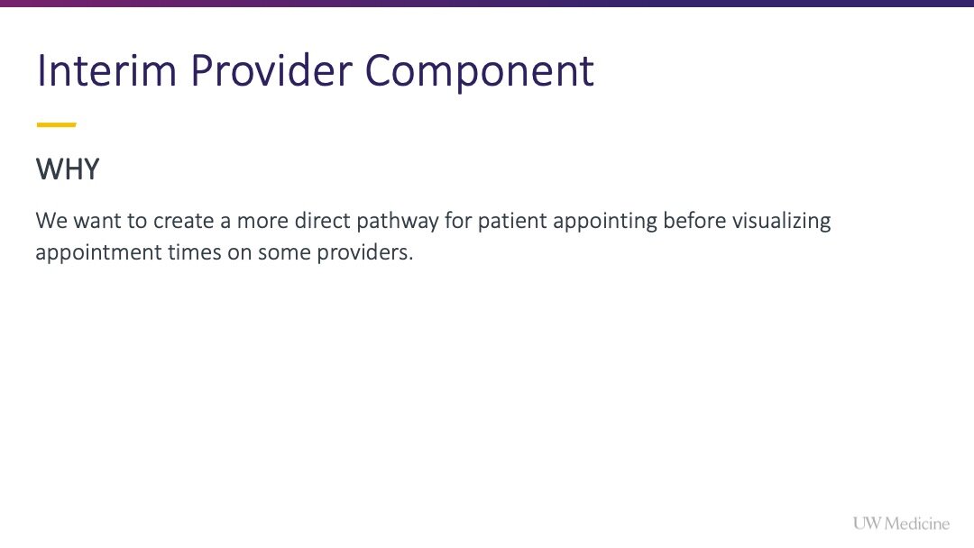
Increase self-appointing actions for patients and decrease call volume to the Contact Center team allowing them to coordinate more complex care.
UX Objective
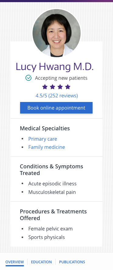
Enable users to book an appointment online from the provider (doctor) bio or location/clinic page.
Context
The previous path to appoint on the UW Medicine website was effortful for patients and failed to contextually situate appointing opportunities across the website.
For example users who completed a Google search and landed on a provider bio, could not schedule an appointment online without leaving the page.
From the provider bio page, it required:
One click on the ‘Make an appointment’ link which loaded a new page.
Then users could click ‘Book now’ on the new page.
This would load an external scheduling experience (eCare/MyChart) creating an opportunity for user abandonment.
Once there, users could only book with select providers, and not necessarily the doctor whose bio they viewed when they clicked ‘Make an appointment.’
“At best the experience to link users from a provider or location page to a general “appointments page” was clunky, and at worst it was misleading, because users were not guaranteed to find their preferred doctor or location within the external online scheduling experience.”
Hypothesis
By enabling users to book online contextually (without leaving the page and with the doctor/location specific to that page), more users will start and complete the appointing process successfully, with fewer clicks and with less friction.
My Impact
I championed this project, gained internal alignment to pursue it, and encouraged the team to fully integrate with the available scheduling widget (from Epic) rather than settling for options that were easier from an engineering perspective but lacked the same elegance and ease for users.
Within the contextual scheduling modals, there is an over 90% booking action completion rate.
Skills showcased
User research
Study design
User flow design
Mapping data configuration scenarios to user flows
UX/UI design
Stakeholder alignment
Developer collaboration and negotiation during style reviews
Design goals
Guide user behavior and more accurately set expectations about provider availability
Increase users’ perceived simplicity of options and ease of use
Key design considerations
Focus users’ attention during task completion
Enable users to immediately understand who can interact with scheduling/management functionality
Leverage the color blue as a visual indicator of scheduling actions across the UW Medicine website
Responsibilities
Provided all user research to justify design decisions
Owned the creation of all user flows
Collaborated to map the user flows to data enablement scenarios for providers and locations
Presented all UX strategy recommendations to align the product team with leadership
Completed all UI design
Redlined the work and prepared hand-off tickets for the development team
Tested all styles, interactions and states to provide sign-off before release
My Process
Concept exploration
Note: The exploratory work for the provider bio redesign and taxonomy creation was happening in tandem with this appointing initiative. Learn how I advocated for, secured buy-in for the bio template redesign to create space for and prioritize smarter presentation of taxonomy terms to aid patient decision-making on this sibling project write-up.
Concept 1 — Multiple CTAs in sidebar
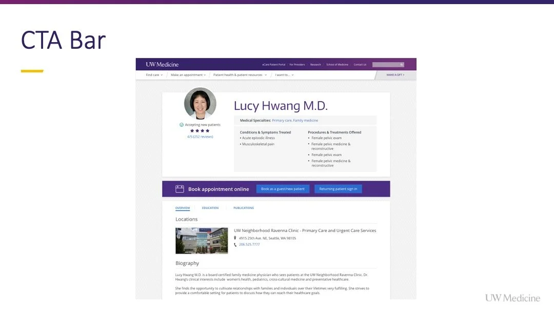
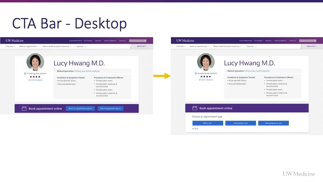
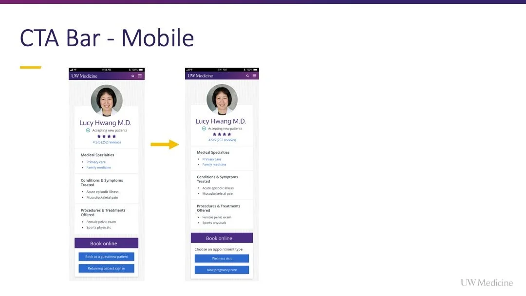
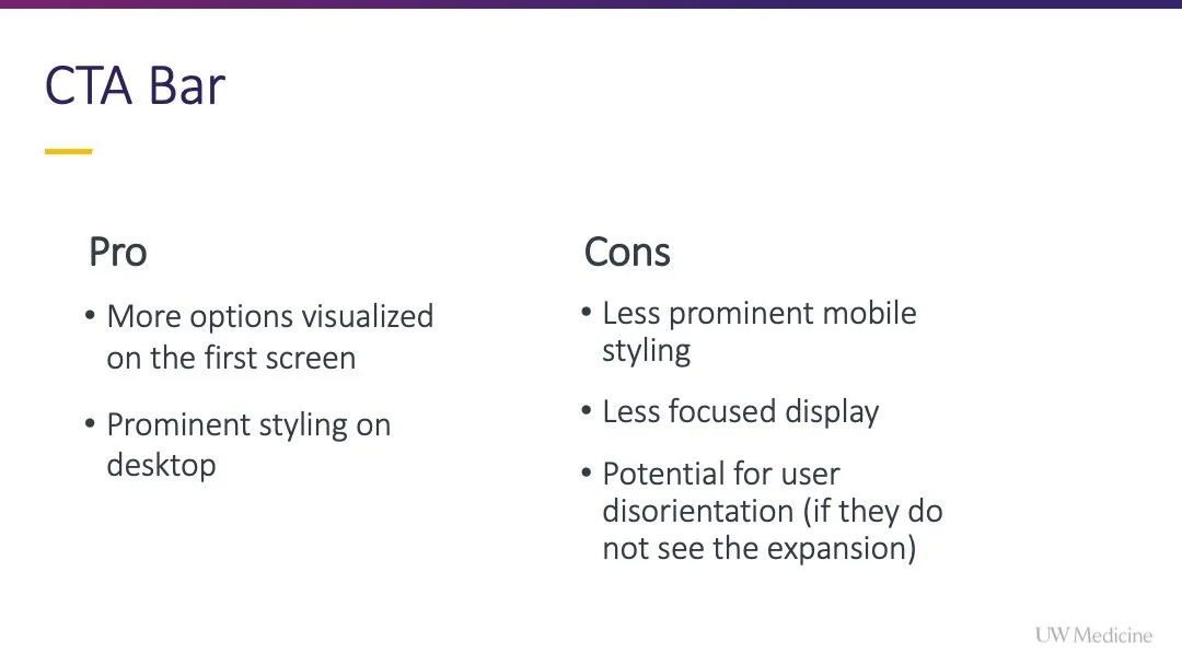
Concept 2 - Inline CTA bar multiple buttons
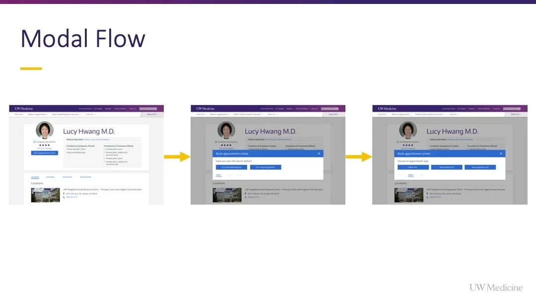
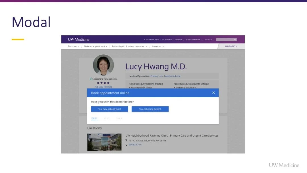
Concept 3 - Single CTA with appointing modal
Review + user testing
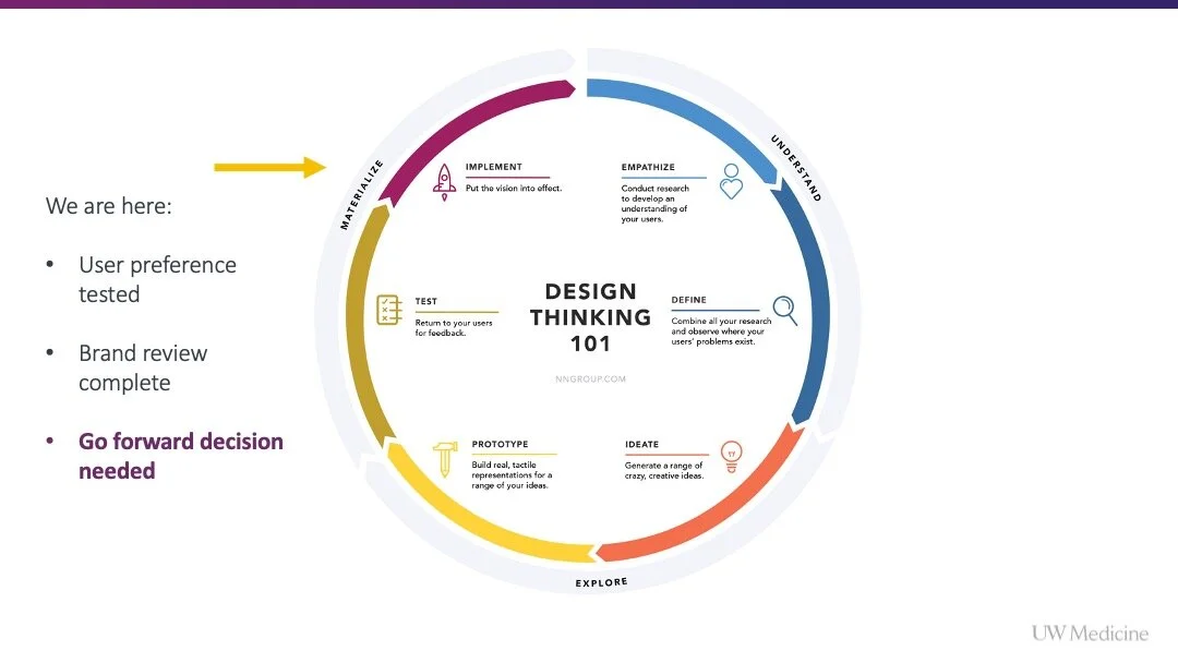
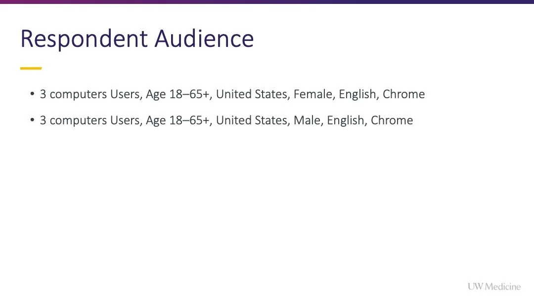
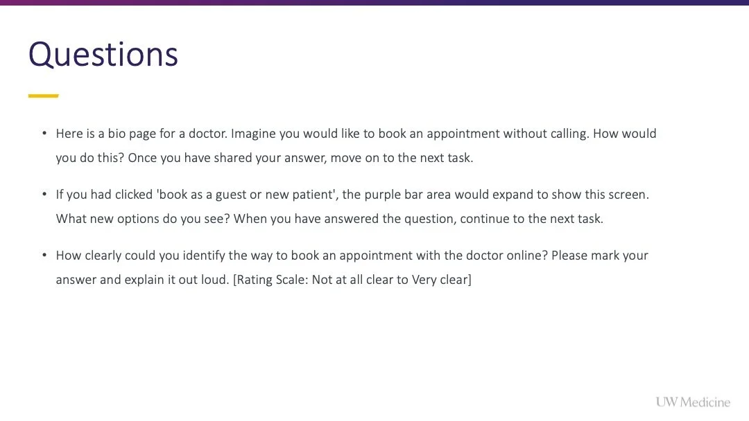
After discussing the preliminary concepts with our Product Owner, we decided to move forward and test the multi-button CTA bar and single CTA with modal concepts with users.
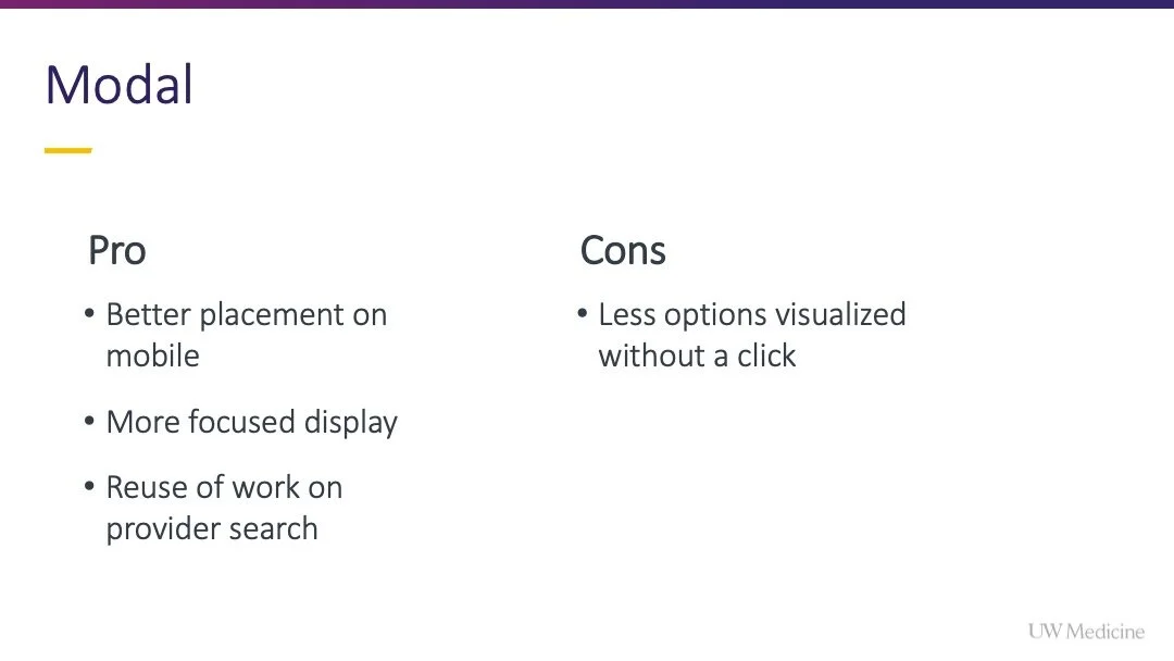
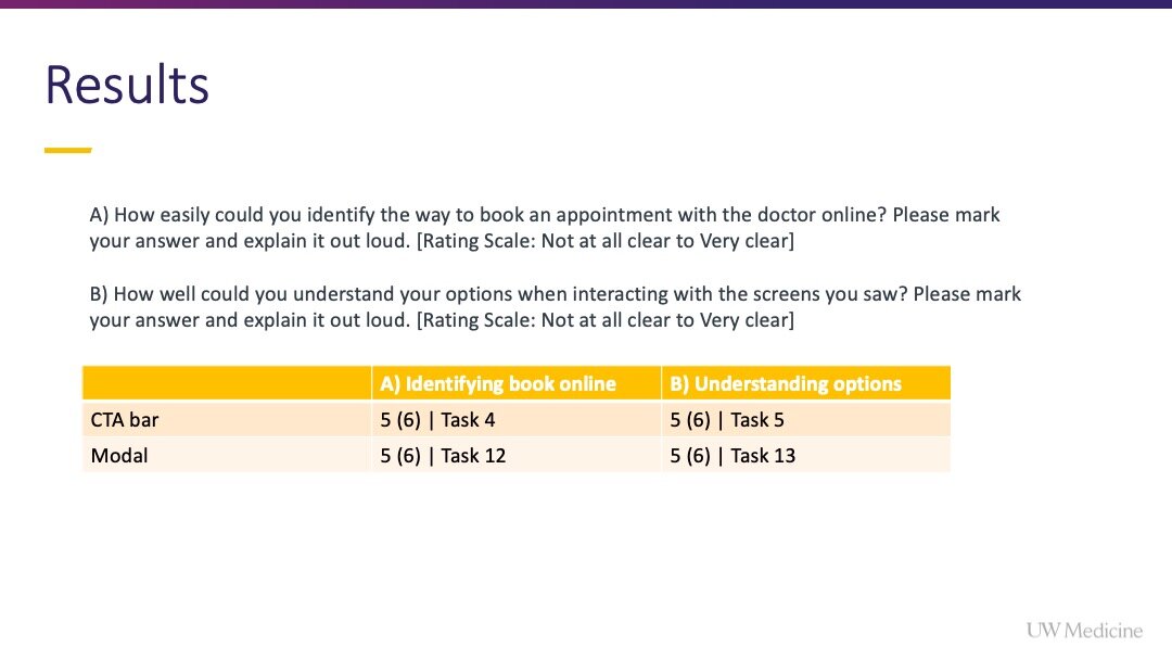
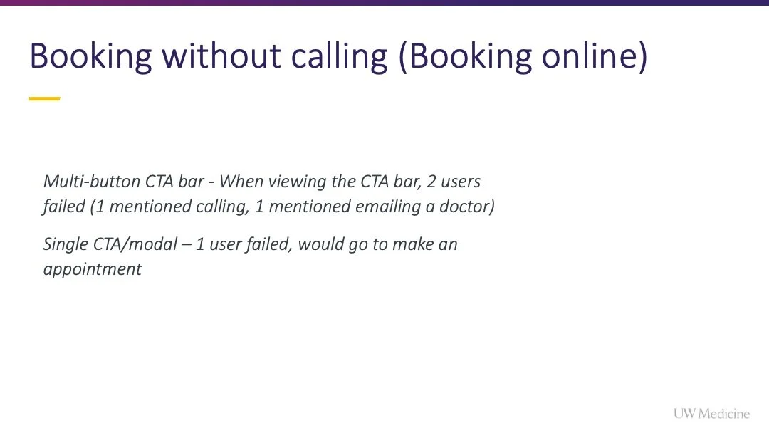
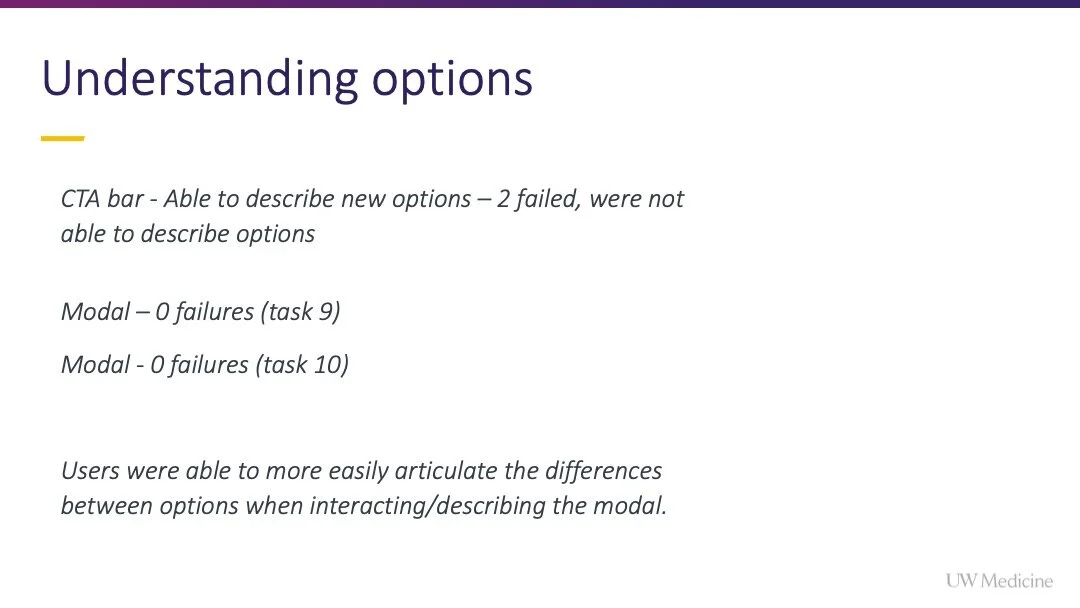
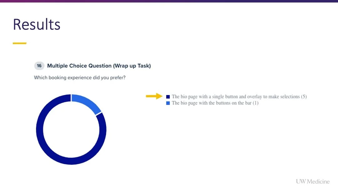
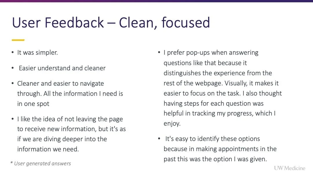
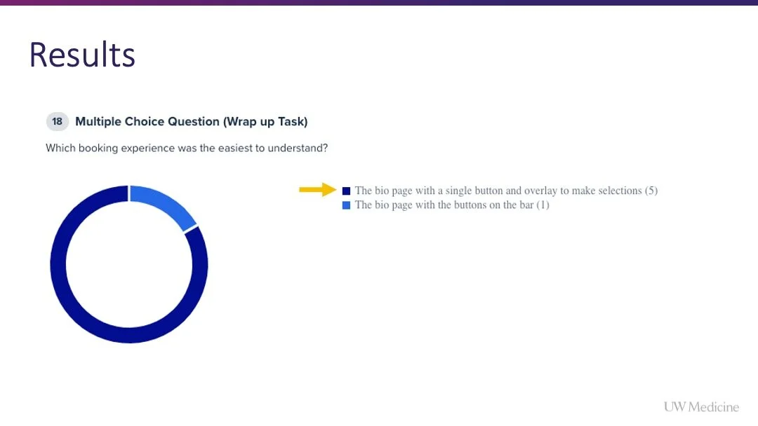
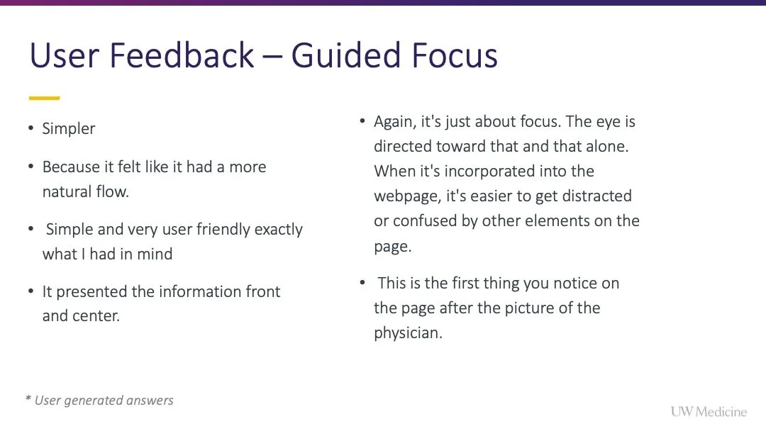
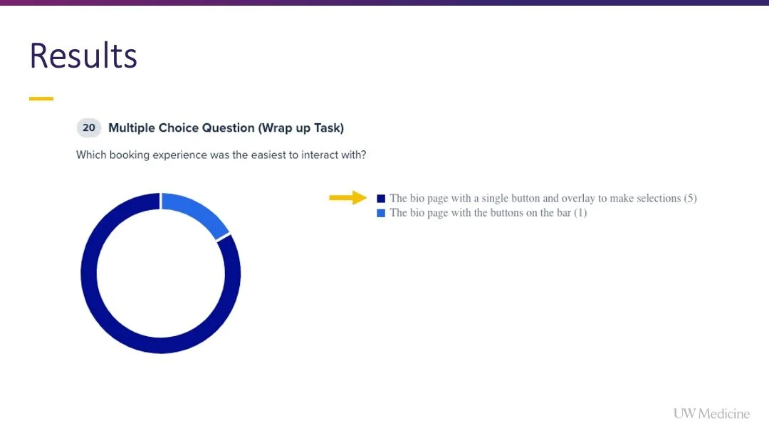
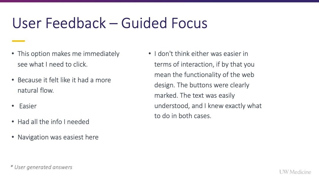
The test showed that users preferred the attentional focus and guided decision-making offered by the single CTA and modal that opened.
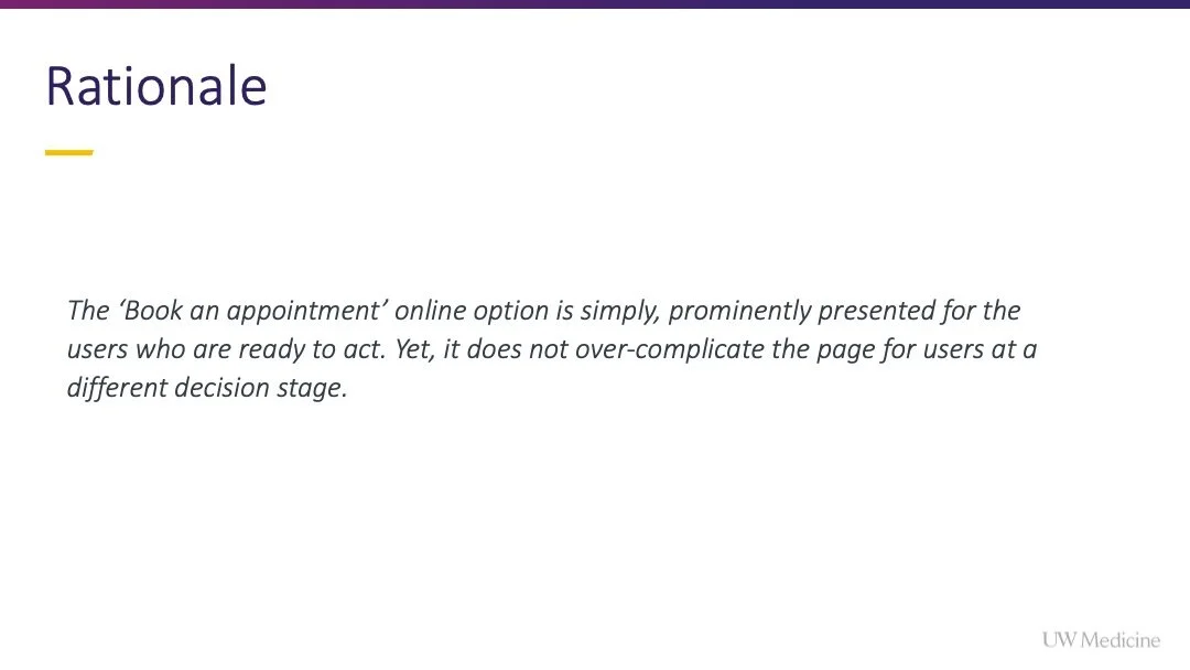
The single CTA prominently presented the available action for the users, yet, it does not over-complicate the page for users at a different stage in their decision making process.
““I like the idea of not leaving the page to receive new information, but it’s as if we are diving deeper into the information we need.”
”
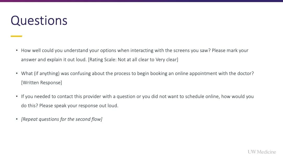
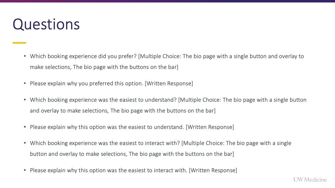
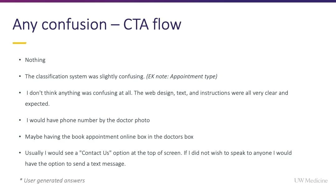
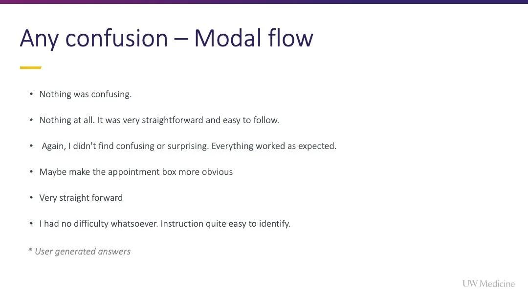
Review the presentation below for more details on the study, results and user reactions.
Scenario mapping
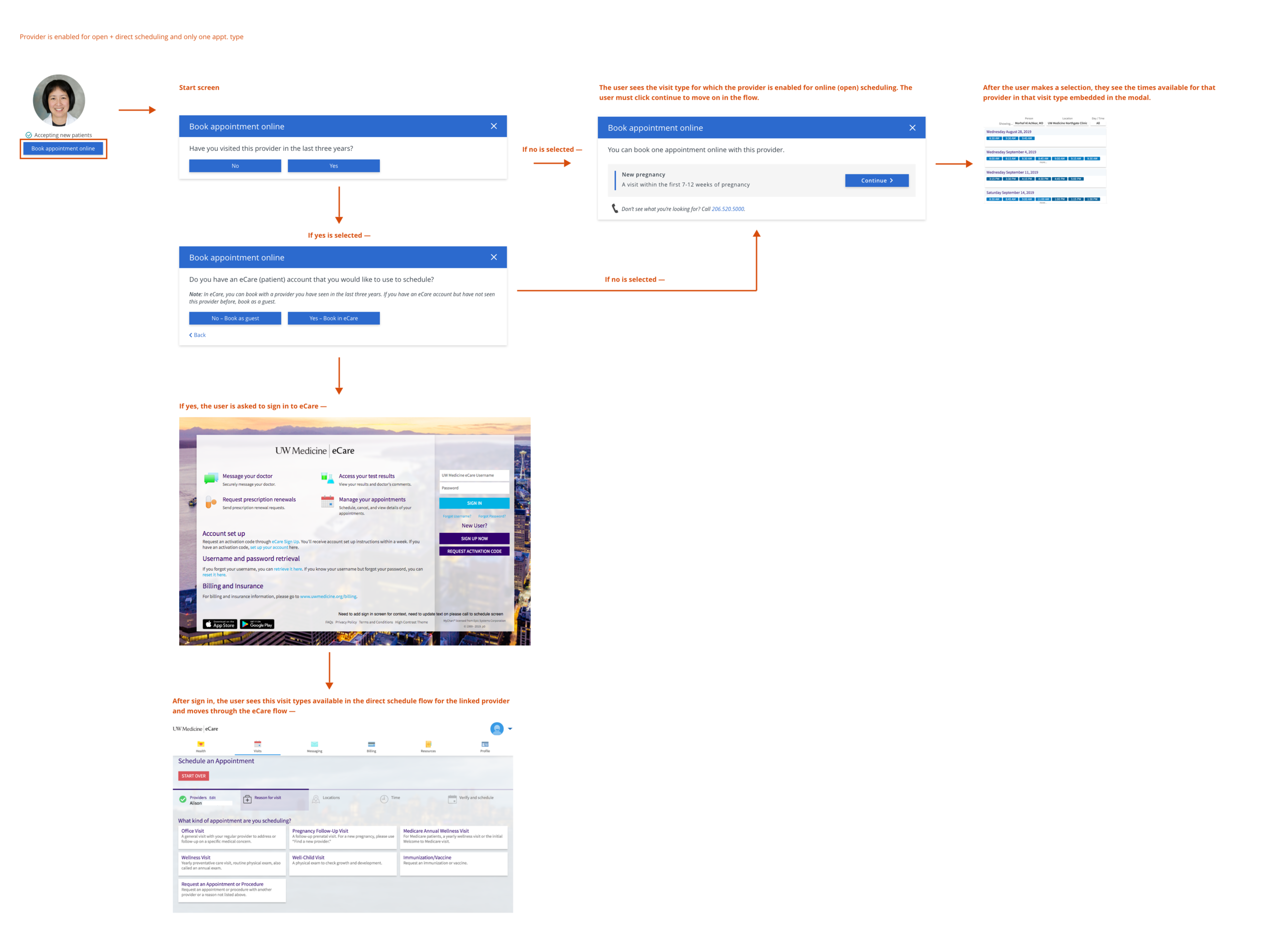
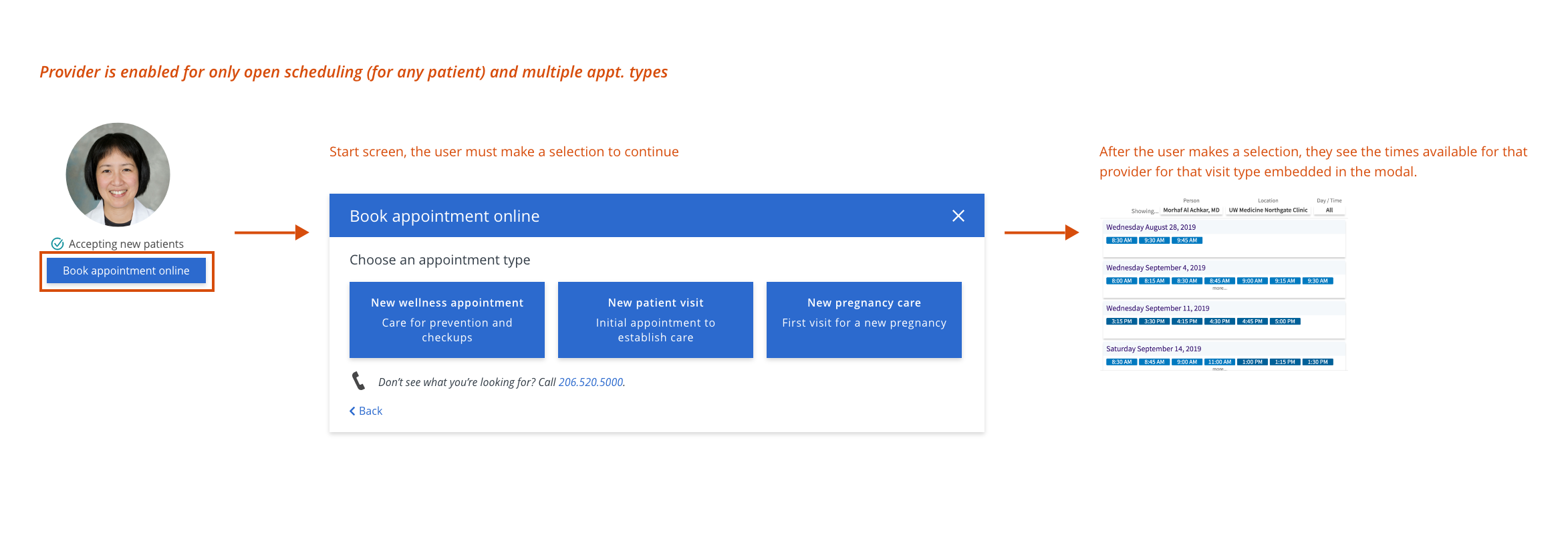
Following the results of the user test, I moved into scenario mapping. I partnered with our Data Manager and Product Owner to understand how the constraints of the data and the system that we would be integrating with (Epic) would impact the sequence and steps in the flow. Our Engineer provided valuable feedback on the possibility of flow steps as we investigated how to build conditional logic within the modal to capture all possible scenario states.
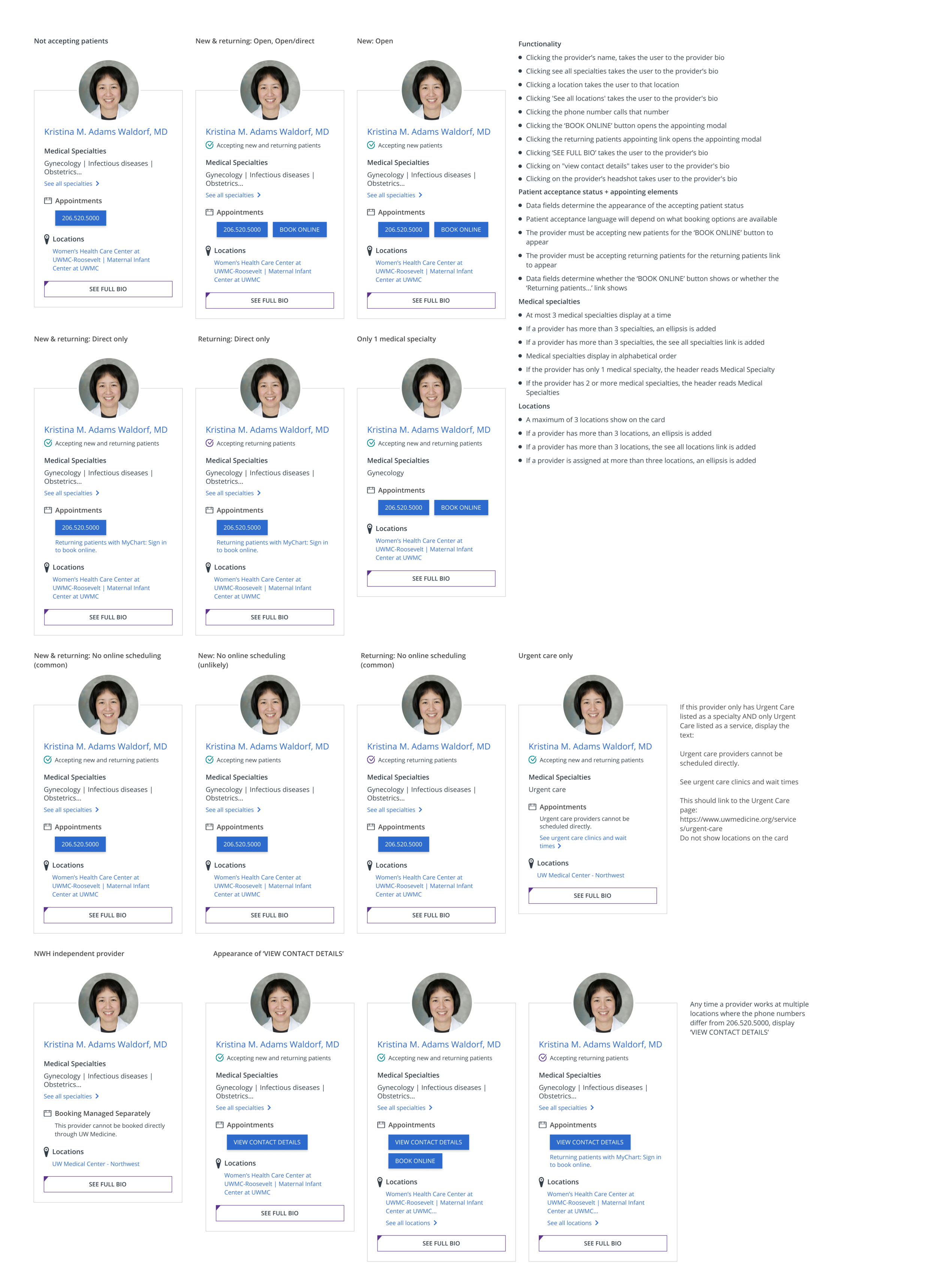
There were tens of scenarios that could result in each of the five flows pictured above. We documented the most common valid and edge cases in a spreadsheet that mapped to each scenario to a user flow and documented how the data variables imported per provider impacted the UI of the top section of the provider bio and provider cards (leveraged as a universal element across the website).
Learn more about the provider bio redesign project, which preceded this work.
Redlining + development review
I redlined the provider scheduling component and impacts to the provider bio headers and cards in Adobe XD. I later transitioned the design documentation to Figma as a part of the design system build I led in 2020/2021.
Redlines can be found by scrolling to this case project appendix.
Structured data + UI element appearance
The appearance of appointing elements (buttons/links) in the provider bio header area and the provider cards (which trigger the appearance of the appointing modal) are determined by structured data variables imported and edited/maintained on the CMS backend. Identifying the different data states needed was a critical part of ensuring accurate contextual pathways for each scenario and building a UI framework that could encompass the required variance.
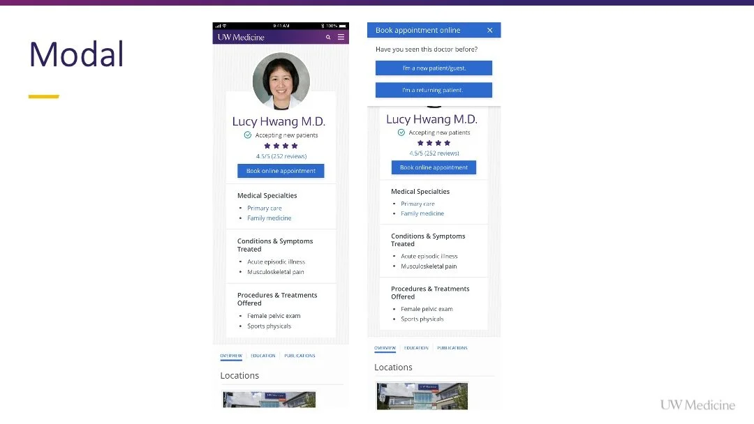
Modal Appearance on UWMedicine.org
Provider + location cards
This universal card element can be viewed across the website in:
Provider search results
Location search results
Specialty pages
Clinic pages (featured clinics)
Clinic pages (provider cards)
