UW Medicine
Provider Bio Redesign for Mobile Priority
Context
Before this summer, the UW Medicine taxonomy grew organically without set governance. There was one taxonomy vocabulary that contained many different types of information including services, specialties, procedures, treatments, tests and synonyms.
Because these terms were not grouped thematically, the display and usage of these terms to structure and automatically populate content across the website was limited.
Business Goal
Create taxonomy vocabularies that matched the way users think about and organize this information so that it is intuitive when searching and scanning the pages for the information they seek.
Provider Bio Before the Redesign
Desktop
Mobile
UX Analysis
On the existing bios, the taxonomy terms were placed under the physician photo. This presented a problem on mobile. The image covered ~75% of the first screen. Given that research by the Nielsen Norman Group shows that users spend 74% of their time within the first two screenfuls of content, this image took up critical real-estate, but the value it offered the user was not equal.
Hypothesis
By redesigning the provider bio, we could provide more context to users about the provider’s expertise and type of care thereby reducing friction for user’s decision making by offering more information up front thus increasing their likelihood to appoint.
Design Goals
1. Improve information prominence.
Problem: Desired information is not easiest to view on the provider bios.
Goal summary: Improve the priority/prominence of key information (top tier items)
2. Improve the guided flow of information.
Problem: Information does not flow with the desired priority across all form factors (screens).
Goal summary: Create an architecture that guides the user through the key information involved in the provider selection process flexible enough to flow effectively from mobile to desktop viewports
Tactic: Reorder elements on all form factors to match desired information hierarchy
3. Improve the flexibility of the template.
Problem: Due to the existing design of the template, the context that users could achieve at a glance was limited.
Goal summary: Establish a more flexible set of containers to enable the iterative addition of features/enhancements in response to testing. Future proof the provider bios for the addition of new visual designations and experiential enhancements.
Tactic: Move key taxonomy categories from the left hand rail into the main viewing area
User Story
As a patient, I would like to quickly understand the expertise of a provider so I can determine whether they are a good match for my needs.
Process: Create Taxonomy Structure
Align with marketing, content and digital strategy stakeholders to discuss problem areas and opportunities
Audit internal site search terms to understand user search patterns on UWMedicine.com
Source 30 terms that represented the breadth of information within the existing Medical Services taxonomy
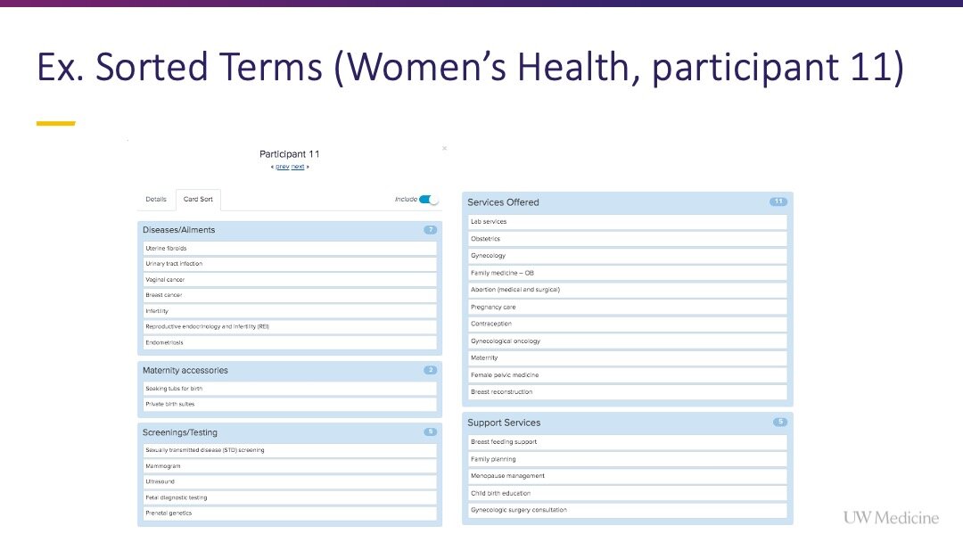
Launch a virtual open card sort
Study built using the Optimal Workshop, Optimal Sort tool
Respondents sourced from UserTesting.com
Purpose: Understand user’s existing mental model for grouping terms and naming the resulting categories
Review the test results and present to stakeholders
Brainstorm category names and map test terms
Launch a virtual closed card sort
Study built using the Optimal Workshop, Optimal Sort tool
Respondents sourced from UserTesting.com
(2) Young adults near Seattle, 18-25 years old
(2) Young adults cross-country, 18-25 years old
(3) Adults near Seattle, 25-50 years old
(2) Adults cross-country, 25-50 years old
(3) Older adults near Seattle, 50-65+ years old
(3) Older adults cross country, 50-65+ years old
Purpose: Understand whether participants could intuitively sort 30 test terms into the categories we created
Open + Closed Card Sort Process Presentation
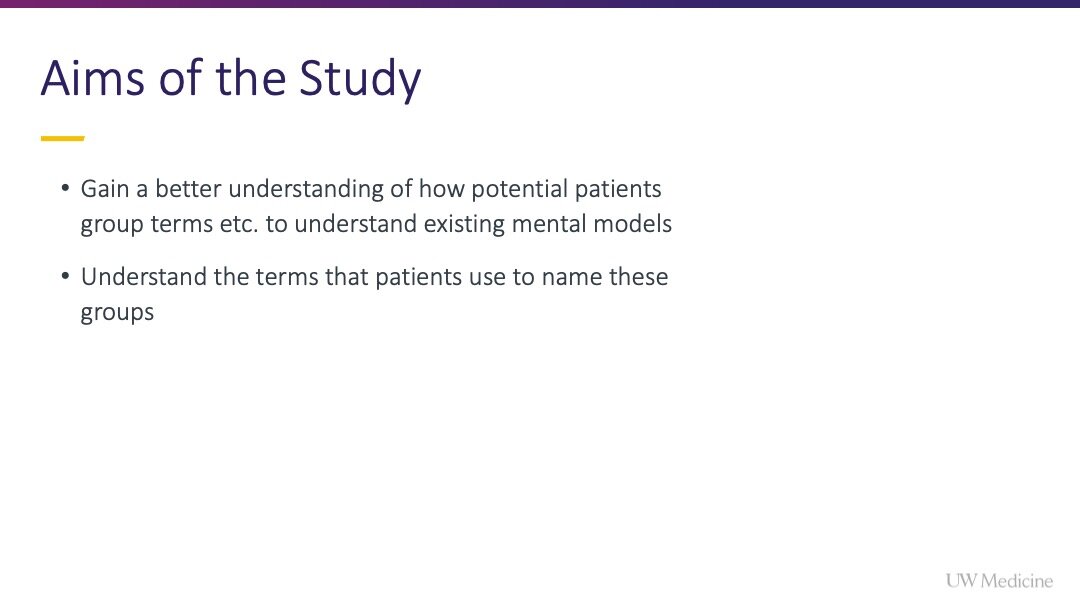
Click a slide to view it | Presented at a UW Medicine stakeholder meeting
Ideation + Sketching Sessions
Once we had an understanding of the number of categories in the UW Medicine taxonomy, and which categories would appear on the provider bio page type, I lead sketching sessions with the content owner of the provider bio pages, to define build empathy, define the problem space and co-create lo-fidelity solutions.
Next I moved on to lo-fidelity sketching in InVision before creating high fidelity concepts and redlines.
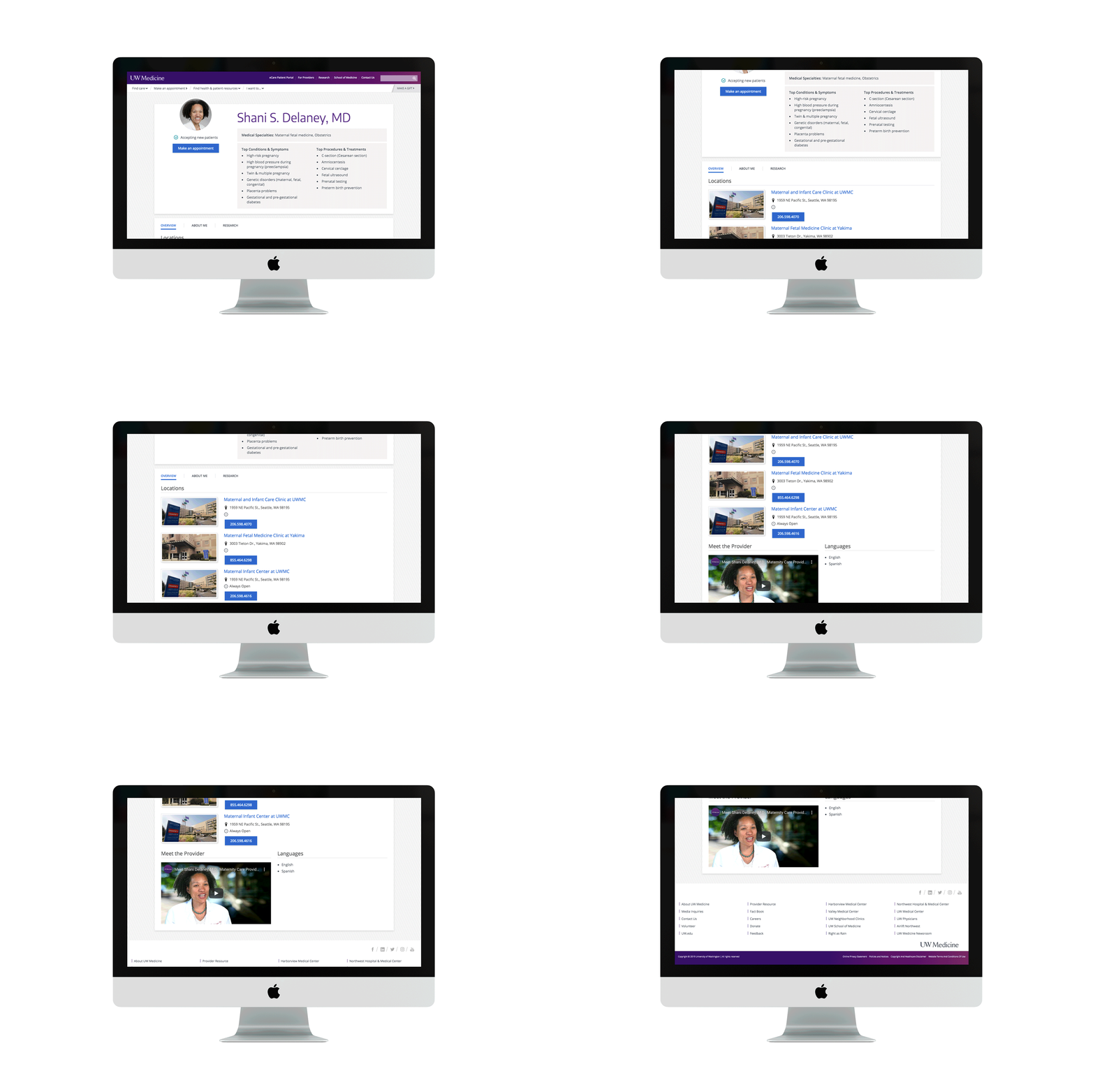
Desktop Provider Bio After Redesign
Full page view
