UW Medicine
Appointments Page Redesign + Responsive Component Creation + Service Design
Note: This page redesign and new components are planned for release in summer 2021.
Business Goal
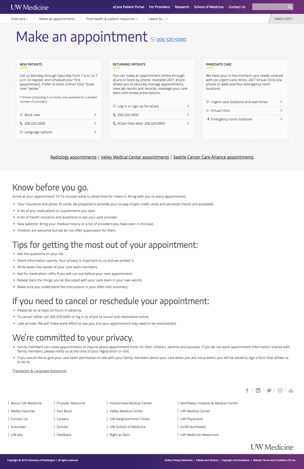
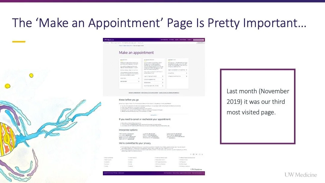
The ‘Make & manage The Make an Appointment page is a critical pathway for users during the patient journey. In November 2019, the ‘Make & manage appointments’ was the third most visited page on the UW Medicine website with 45,548 pageviews. Given its high traffic, the page was underperforming in a few key areas. From a usability perspective, it wasn’t easy to consume. From a business perspective, it wasn’t organized to direct patients toward self-service options, thus alleviating pressure on the Contact Center.
UX Analysis/Strategy
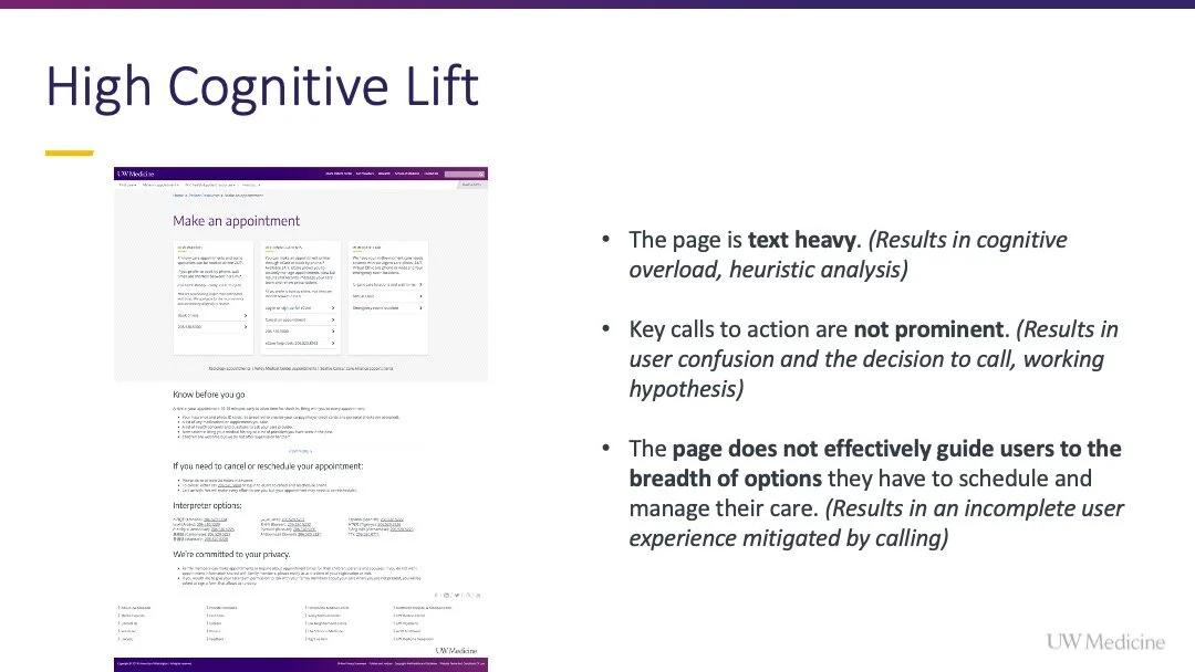
The existing page was text heavy. (Results in cognitive overload for users, heuristic analysis)
Key calls to action are not prominent. (Results in user confusion and the decision to call)
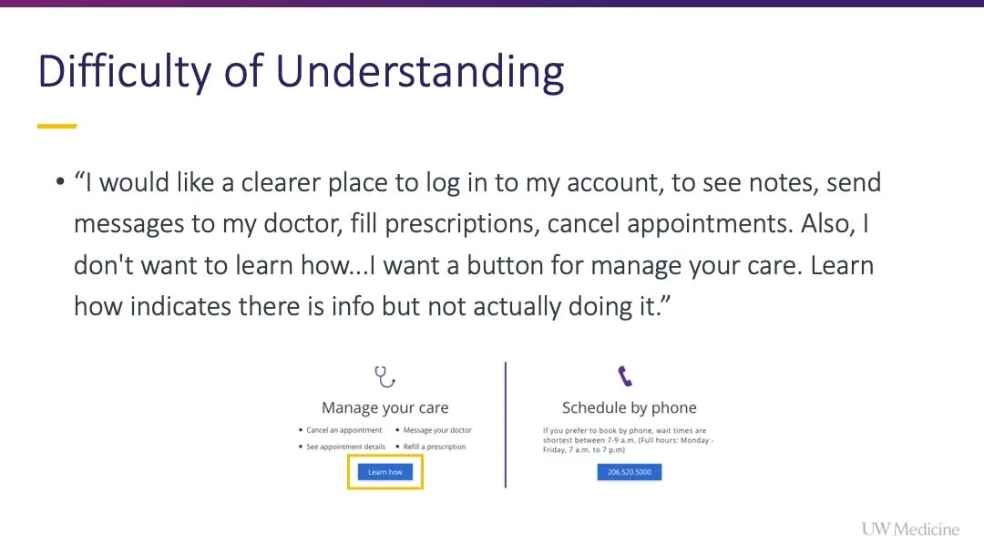
The page does not effectively guide users to the breadth of options they have to schedule and manage their care. (Results in an incomplete user experience that patients mitigate by calling)
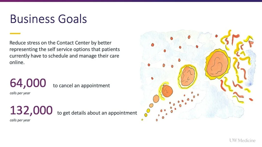
Yearly, 64,000 patients call the Contact Center to cancel an appointment and 132,000 call to get details about an appointment. The high volumes of these calls indicated intent. By emphasizing these pathways on the new page, we saw an opportunity to reduce stress on the Contact Center by better representing the self service options that patients currently have to schedule and manage their care online.
Before beginning the redesign, I reviewed page pathing in Google Analytics. I wanted to understand if a user visited the ‘Make an Appointment’ page, what pages did they visit before, and what pages did they visit after. After visiting the ‘Make an Appointment’ page a considerable number of user were visiting the provider search, location search, a location/clinic page a provider bio or a specialty, rather than taking an appointing action.
“This indicated there was an audience who needed to explore more before making an appointing decision that was currently underserved.”
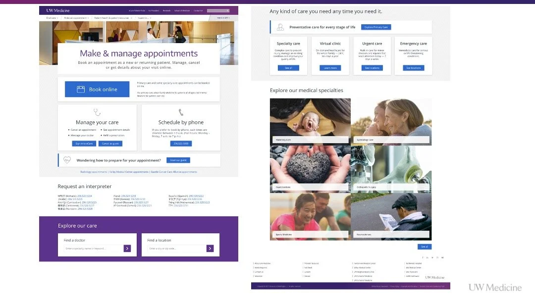
To meet the needs of this audience, I wanted to introduce search field components onto the page, to serve this audience need. If users were seeking this information, I wanted to visualize the entry point for them along with introducing information about medical specialties onto the page.
Audiences using the page "quick archetypes"
Given the purpose of the page, data on call center usage and the intelligence achieved looking at the page pathing, we named three core user archetypes accessing the page.
User scheduling an appointment / Core intent of the page
Users managing care (canceling, getting appointment details) / Data received from call center on volumes and patient asks
Users exploring care options / Data from page pathing in Google Analytics
Page Before the Redesign
User Story
As a patient, I would like to quickly understand my options to schedule or manage care, so that I can accomplish my task efficiently.
Two key opportunities are being addressed:
Information architecture and focus of the Make an Appointment page is being centered around key appointing actions and purposes for creating new and managing existing appointments.
Visual prominence and organization of key calls to action are enhanced based on end-user studies and feedback.
Hypothesis
More appointments will be generated because the information is more clearly organized.
More users will make appointments online because the pathway prominence has been enhanced.
Users will be able to manage their appointments more easily because those calls-to-action are visually distinct and easier to find.
The Contact Center will have to service fewer calls for actions users can complete independently, such as appointment cancellation.
Why Now?
There are three key reasons for surfacing this improvement:
The Contact Center needs to reduce its workload to more manageable and sustainable levels.
Studies internally and externally have shown that a majority of users want to schedule appointments and manage their appointments online.
Users are more technically savvy and expect simple and accessible online services.
Context
The redesign of the UW Medicine scheduling experience was limited to the frontend presentation on the UW Medicine website. The web team does not own the eCare patient scheduling tool, where users are linked from this page.
We are in future talks to influence improvements and the re-organization of scheduling flows within that platform, but it was out of scope for this project.
My Impact
Skills showcased
User research
UX/UI design
Consensus building
Stakeholder management
Design goals
Reduce users’ cognitive load when consuming the page.
Reduce the text on the initial page.
Reorganize the page to better guide user behavior and more accurately set expectations about the breadth of available actions.
Increase users’ perceived simplicity of options and ease of use on the page.
Re-organize the page so that it more effectively guides patients at all stages of their journey.
Key design considerations
Enable users to immediately understand who can interact with scheduling/management functionality.
Mobilize Gestalt principles to improve the scannability of available actions with context and buttons separated into a common region for each thematic area.
Continue leveraging the color blue as a visual indicator of scheduling actions across the UW Medicine website.
Resposibilities
Provided all user research to justify the redesign, audit the usability of competitive scheduling flows and preference test the final designs
Presented all UX strategy recommendations to align the product team with leadership
Completed all page UI design
Redlined all assets and built out the component library for the development team
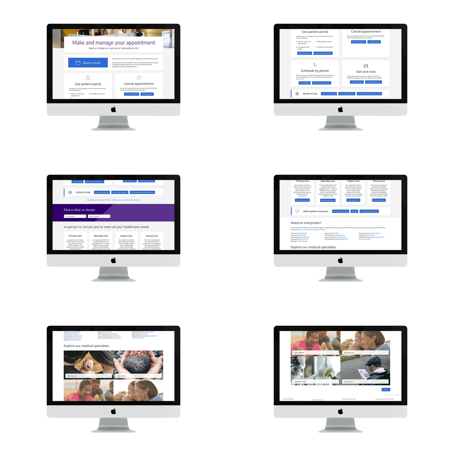
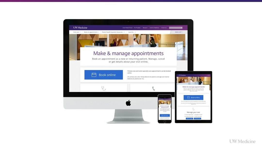
Finished Desktop Page Design in Situ
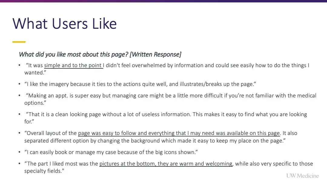
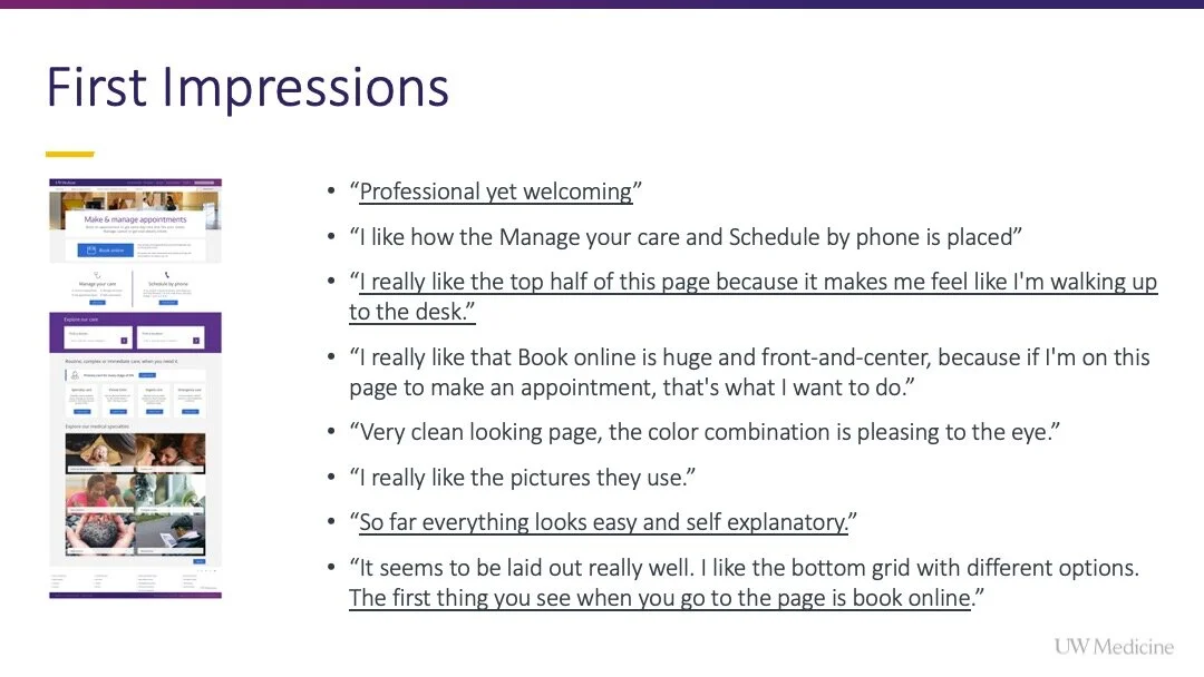
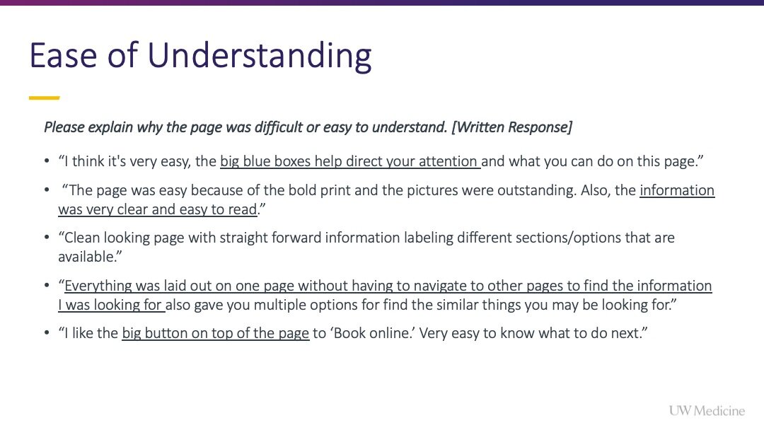
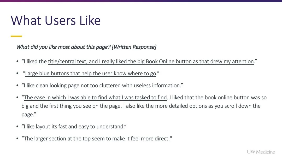
““You can just BOOM, ‘Book online.’ I don’t need to read everything else. [...] It’s just right there in the middle where your eyes go in and where people want to click because people want to book online.”
”
Key Research & Considerations That Informed the Final Design
The page header and intro text provide context to new and returning visitors.
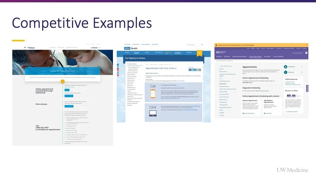
I leveraged images, box overlays and patterns to create a “mixed media” feel to the page, to visually differentiate it from the flat, staid appointment pages I encountered in my competitive audit.
The yellows in the image pair well with the UW Medicine “primary purple” brand color to create a welcoming first impression for users.
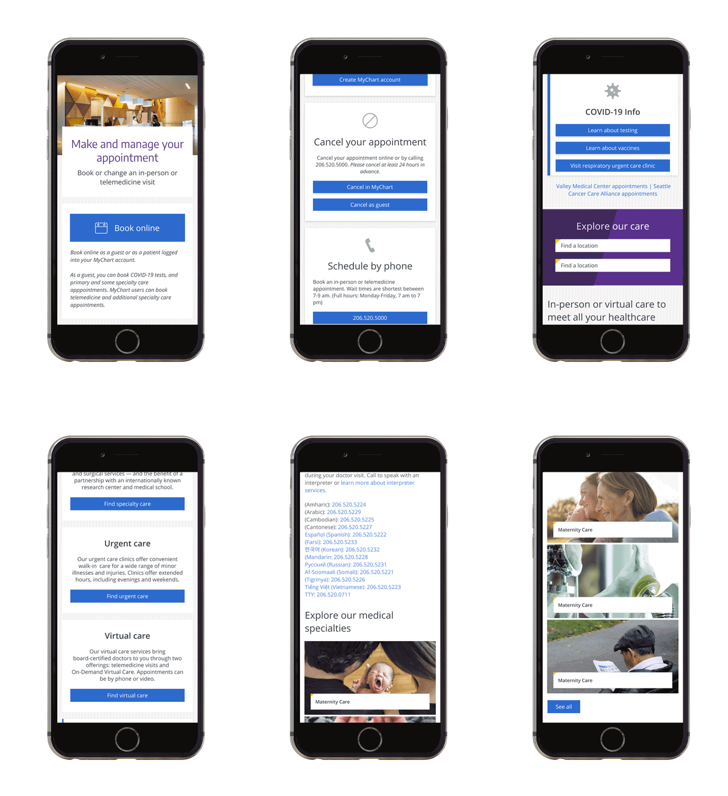
The most requested pathway (online booking) is the largest and is listed first, so it is the first option users encounter when the components (blocks) stack on mobile.
““I really like the top half of this page because it makes me feel like I’m walking up to the desk.””
Responsive Stacking
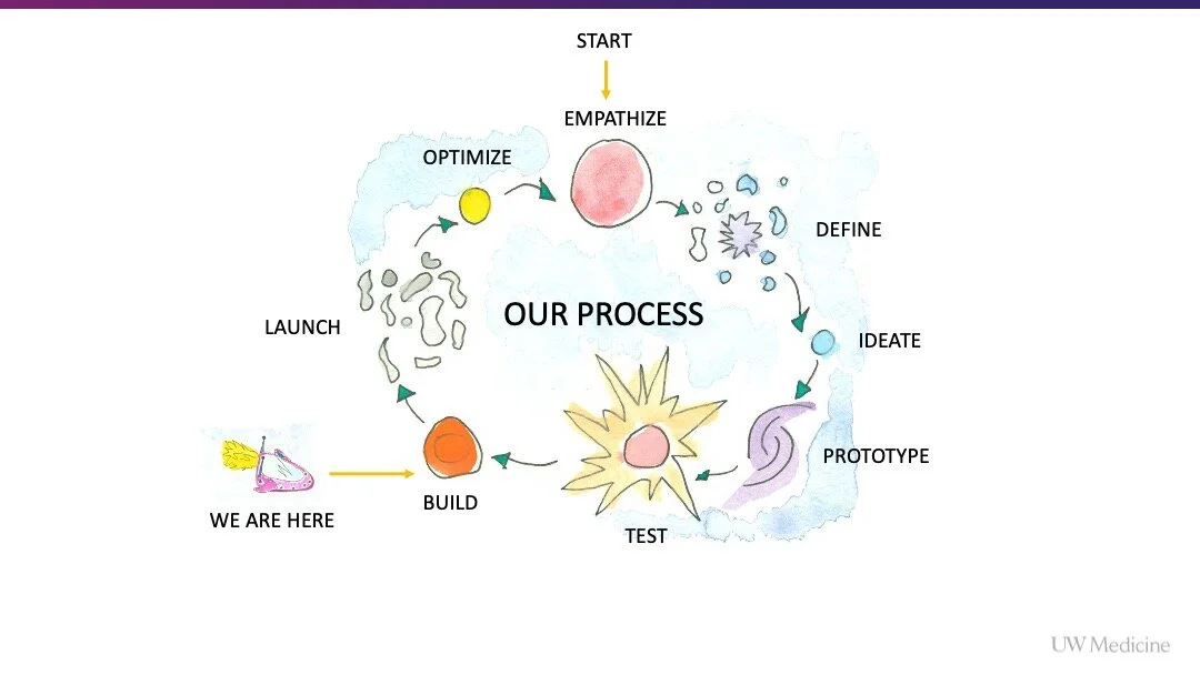
Presentation Gallery About My Process Redesigning the Page
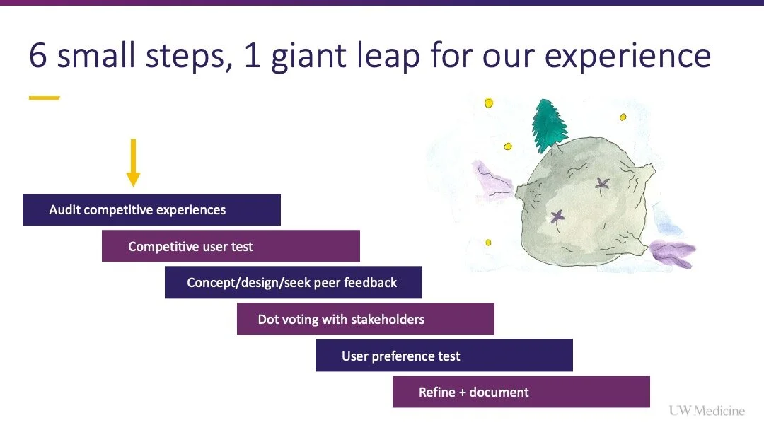
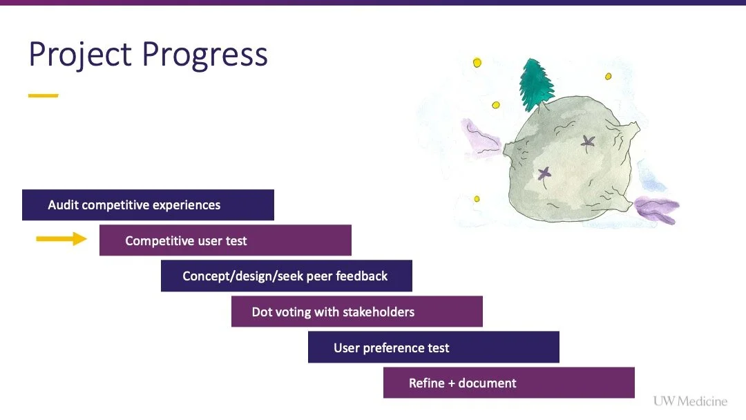
Process Summary
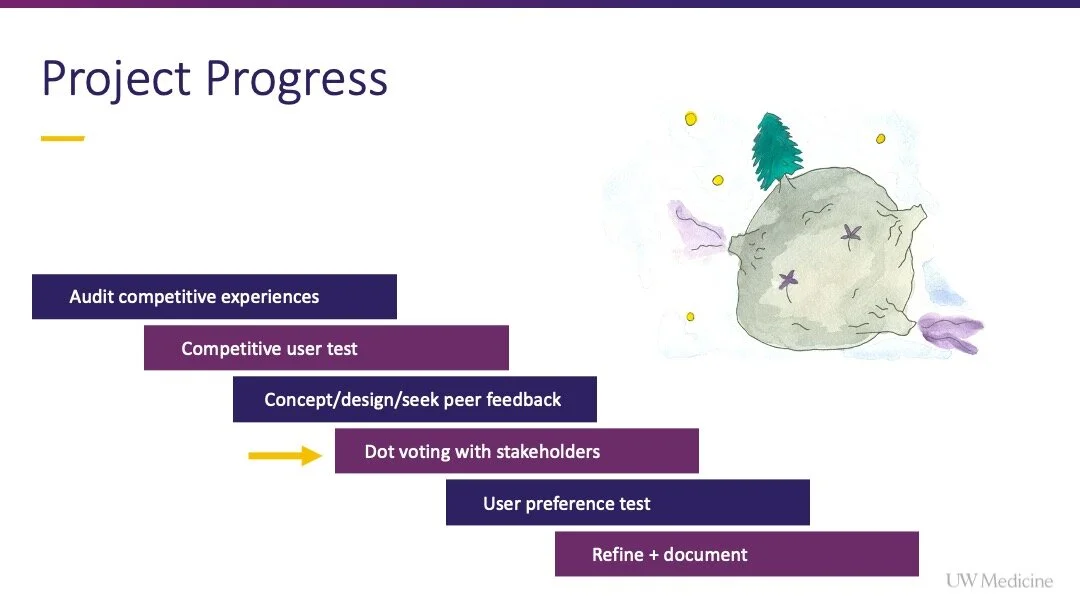
1. Competitive experience audit
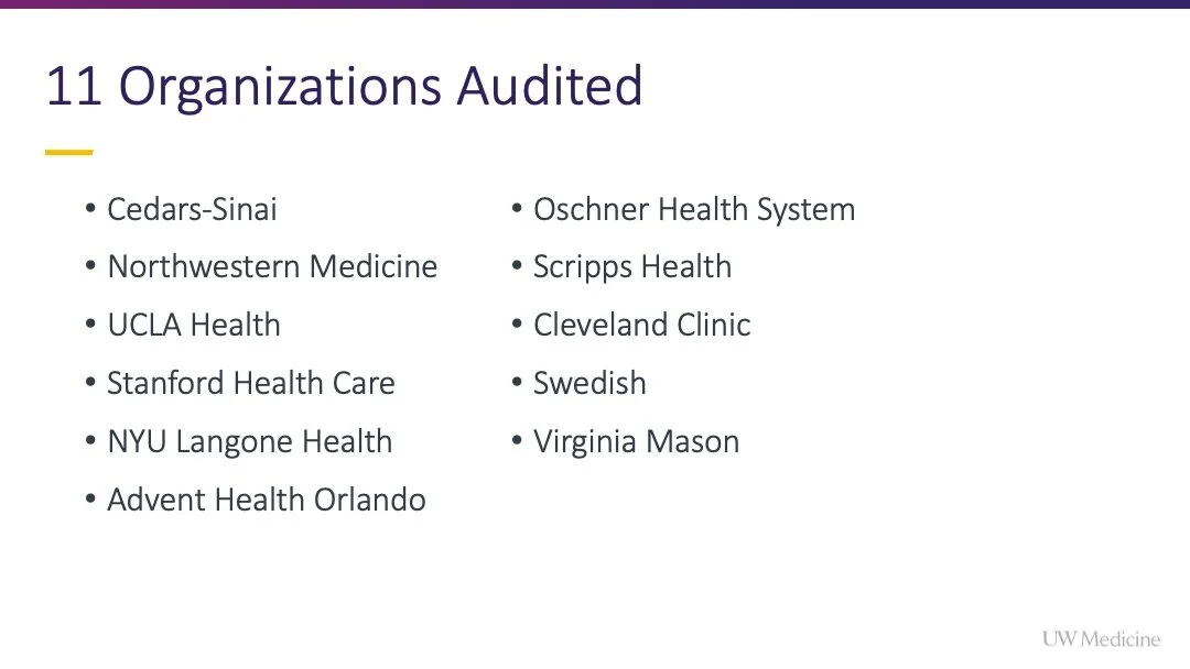
I audited 11 competitive experiences within the healthcare vertical using custom created criteria.
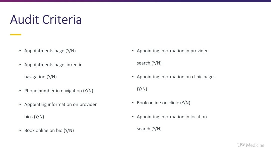
Audit criteria
Appointments page (Y/N)
Appointments page linked in navigation (Y/N)
Phone number in navigation (Y/N)
Appointing information on provider bios (Y/N)
Book online on bio (Y/N)
Appointing information in provider search (Y/N)
Appointing information on clinic pages (Y/N)
Book online on clinic (Y/N)
Appointing information in location search (Y/N)
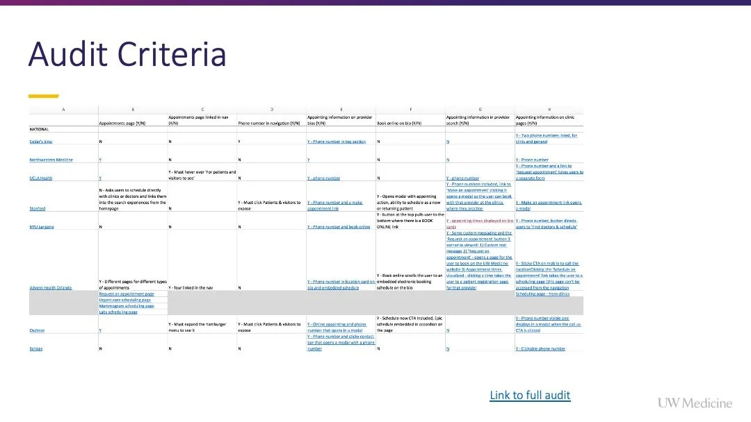
View the audit [Link]
Takeaways
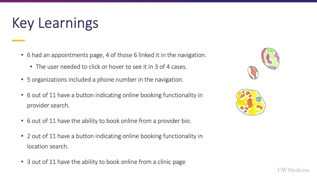
6 had an appointments page, 4 of those 6 linked it in the navigation.
The user needed to click or hover to see it in 3 of 4 cases.
5 organizations included a phone number in the navigation.
6 out of 11 have a button indicating online booking functionality in provider search.
6 out of 11 have the ability to book online from a provider bio.
2 out of 11 have a button indicating online booking functionality in location search.
3 out of 11 have the ability to book online from a clinic page
2. Competitive user test
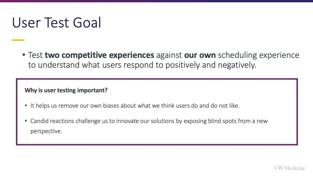
Goal:
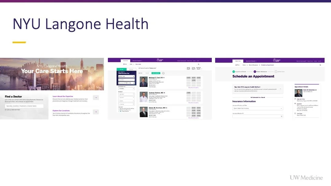
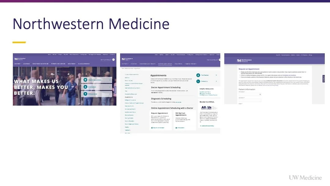
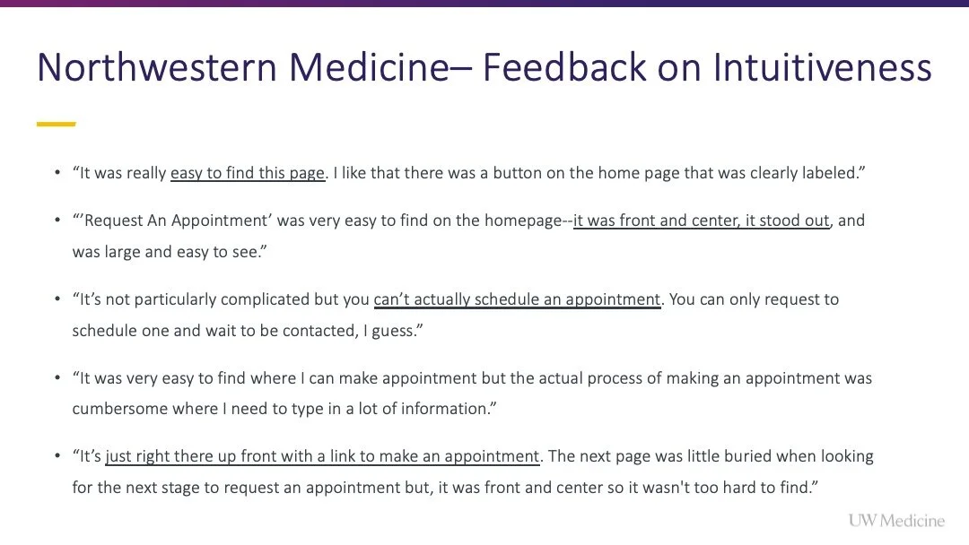
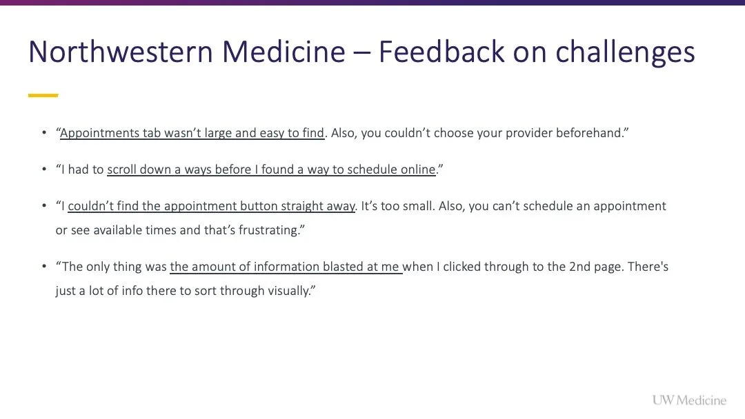
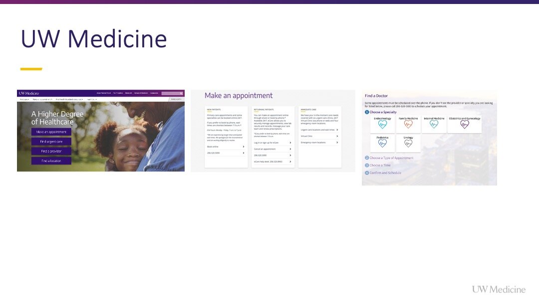
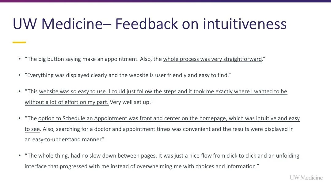
Test two competitive experiences against our own scheduling experience to understand what users respond to positively and negatively.
Respondent panel sourced from UserTesting.com
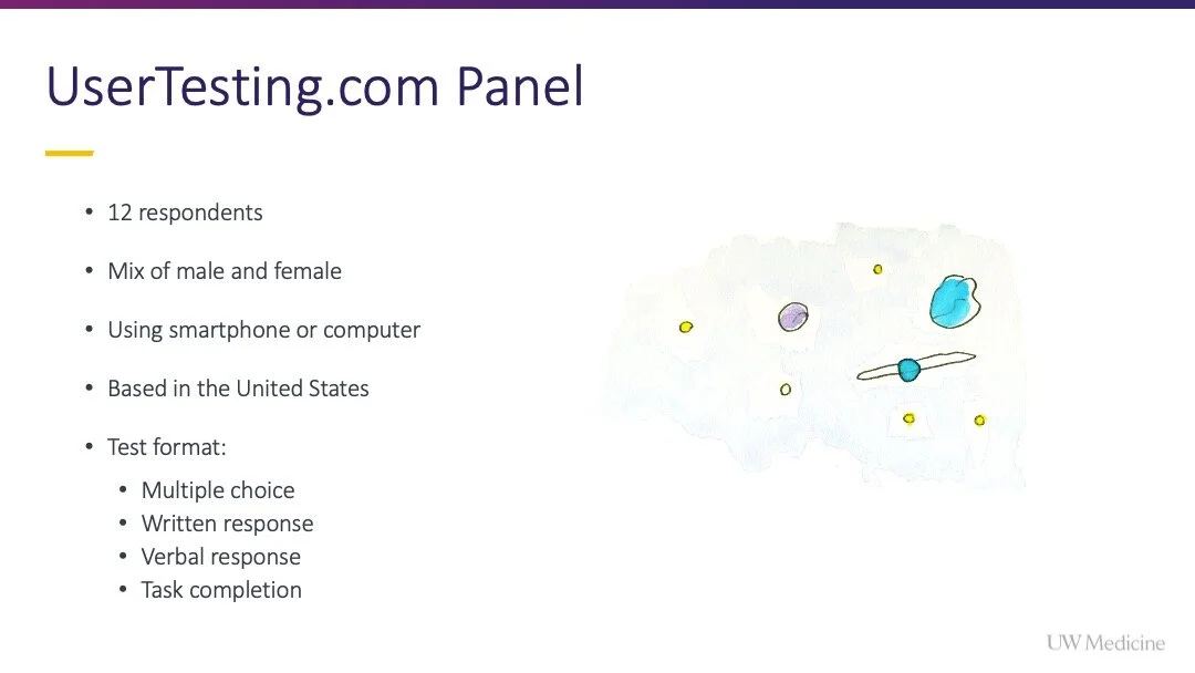
12 respondents
Mix of male and female
Using smartphone or computer
Based in the United States
Test format:
Multiple choice
Written response
Verbal response
Task completion
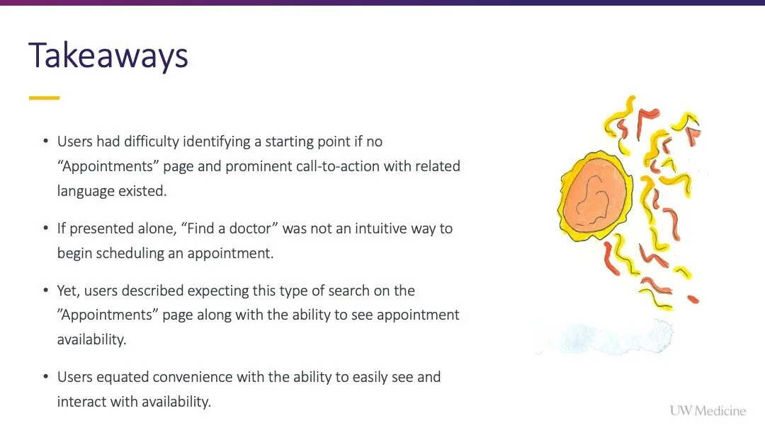
Takeaways:
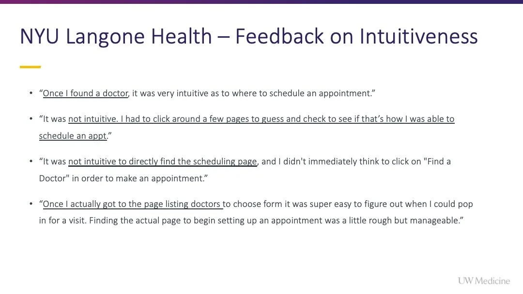
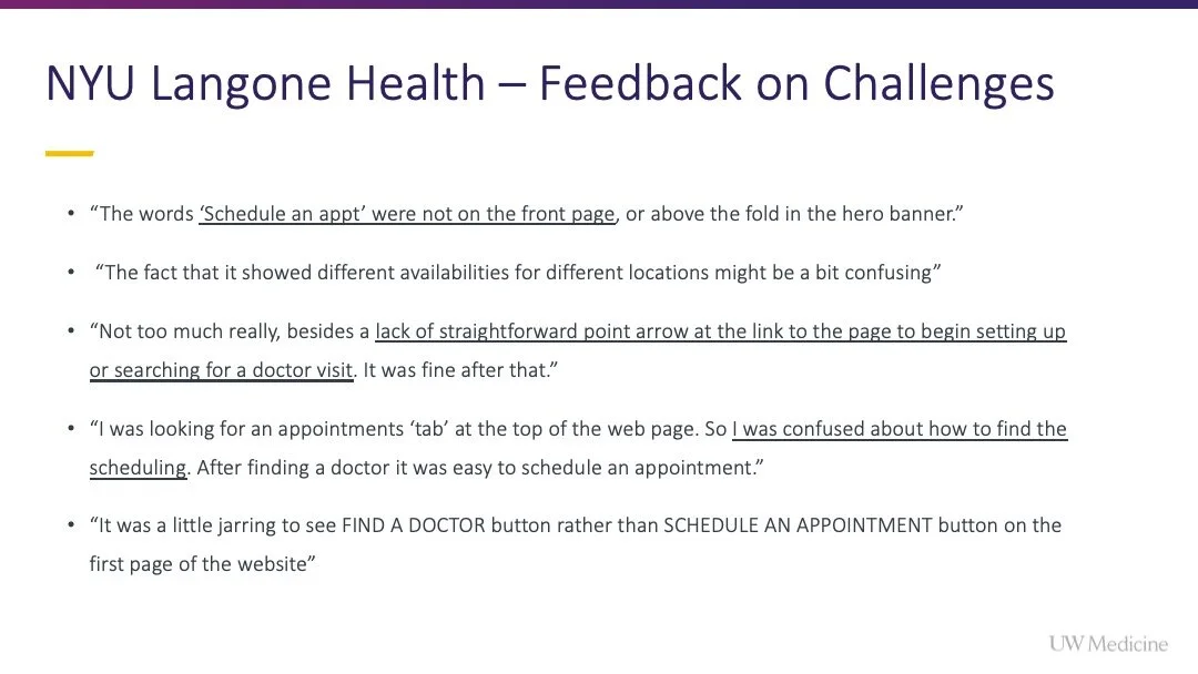
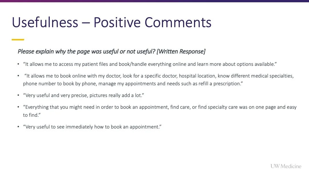
Users had difficulty identifying a starting point if no “Appointments” page and prominent call-to-action with related language existed.
If presented alone, “Find a doctor” was not an intuitive way to begin scheduling an appointment.
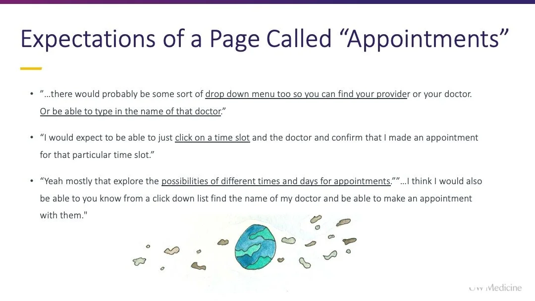
Yet, users described expecting this type of search on the ”Appointments” page along with the ability to see appointment availability.
Users equated convenience with the ability to easily see and interact with availability.
3. Concept, design, seek feedback
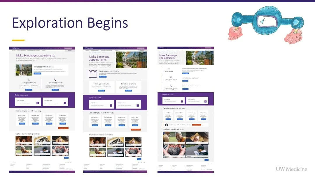
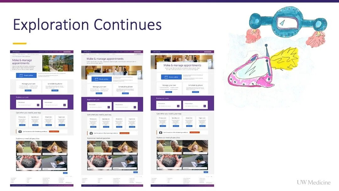
I developed over 15 unique concepts to share with peers during live feedback sessions over the course of a week. I led dot voting sessions to understand which elements of the concepts, to keep, refine or omit.
The purpose of this exercise was to break beyond what a traditional healthcare appointments page looks like to push toward something that felt, accessible, modular and engaging, like somewhere you wanted to be in the digital landscape
Click to view one in more detail.
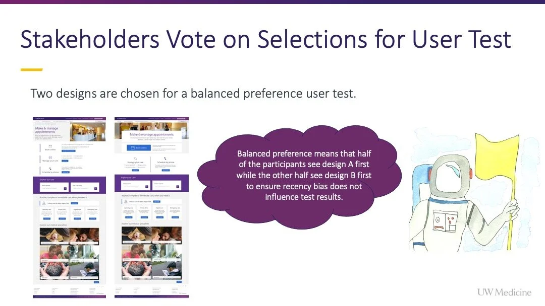
4. Dot voting with stakeholders
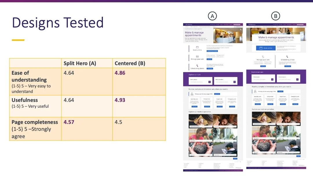
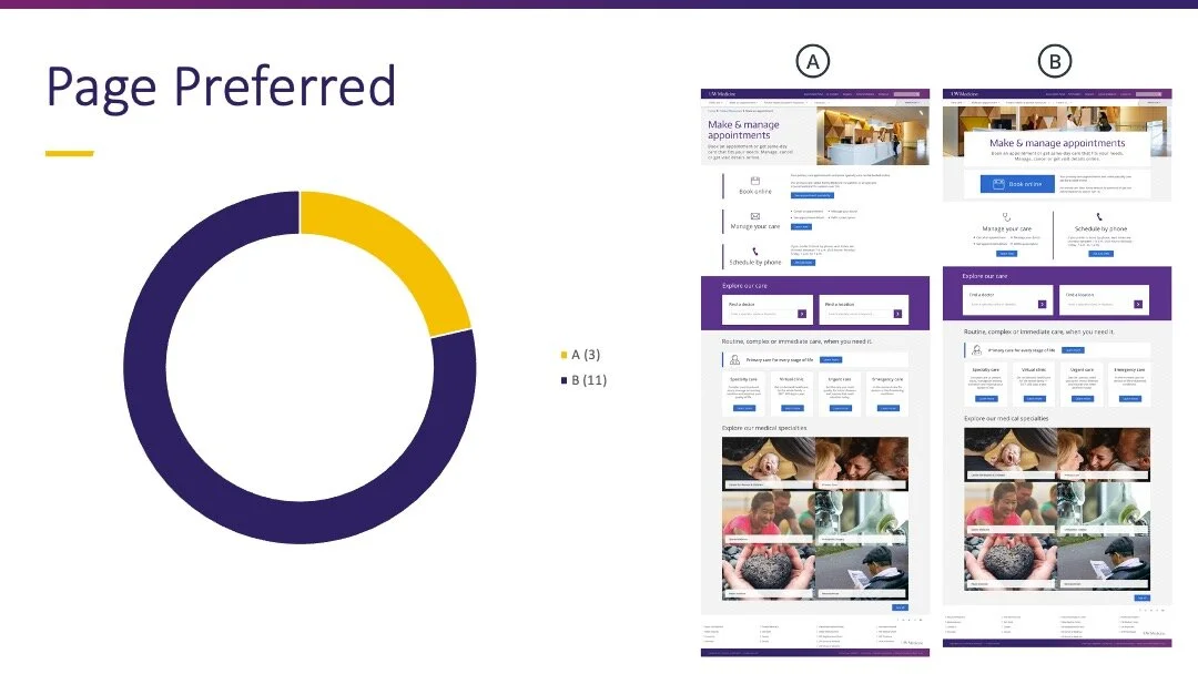
I asked stakeholders representing digital strategy, marketing and brand to vote on two designs that would be preference tested against each other to determine the direction for design refinement.
5. User preference test
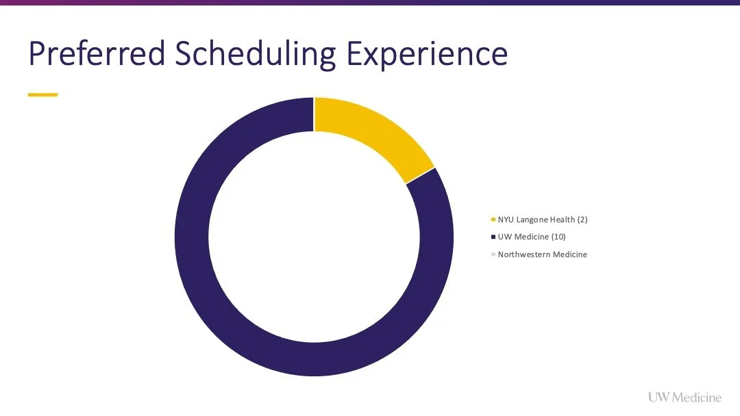
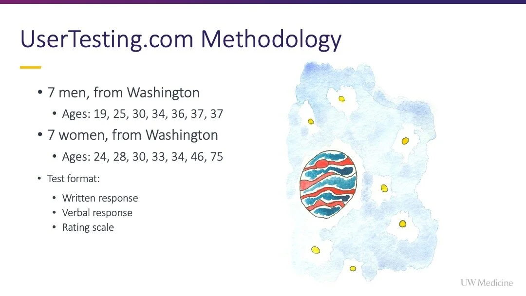
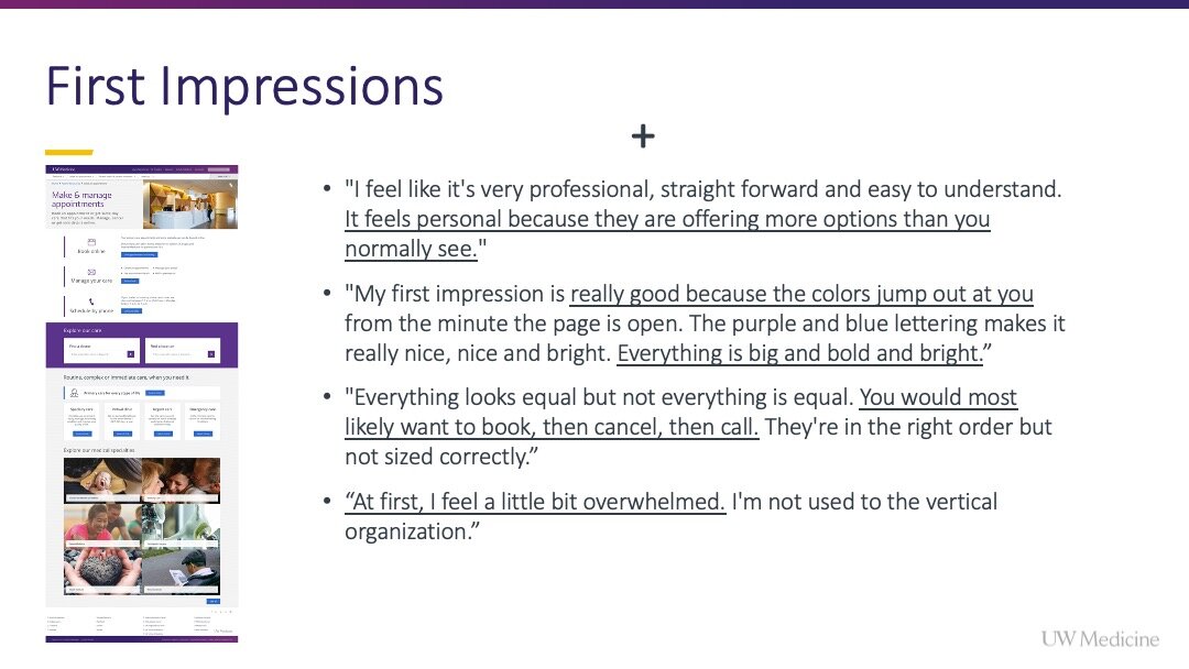
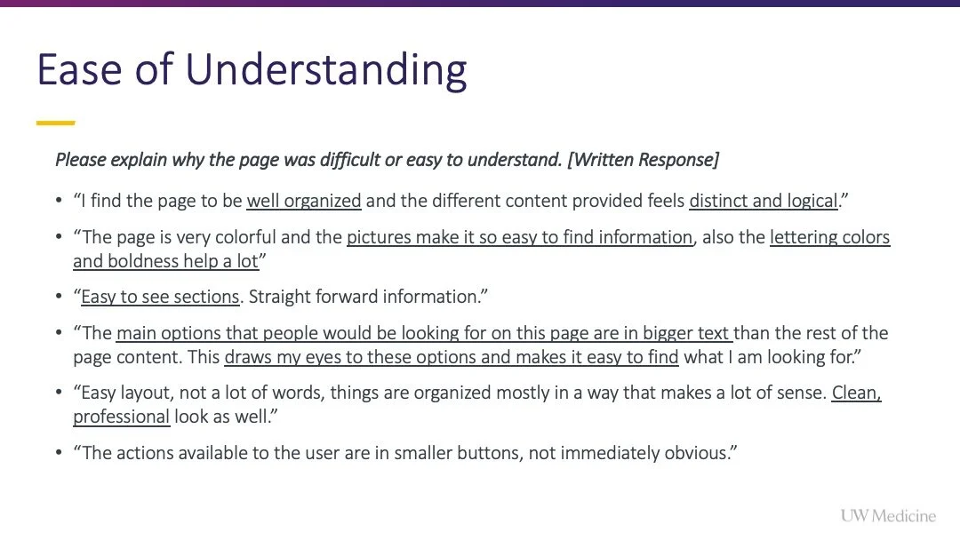
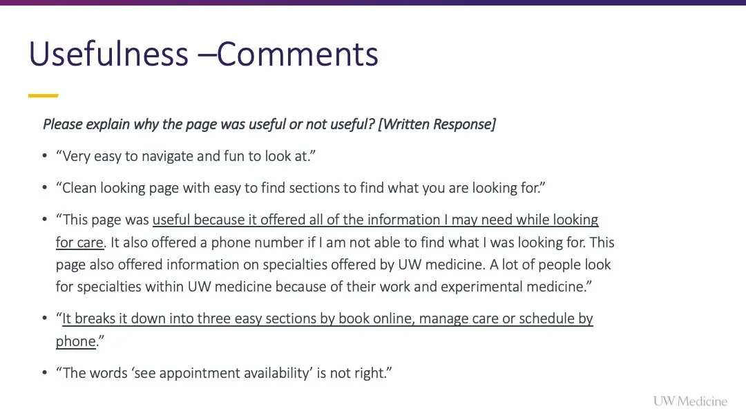
You can see the respondent panel on the slide, sourced from our testing tool UserTesting.com
In each test, users were asked general questions about their healthcare scheduling behavior, but also to book an appointment proceeding as far as they could without scheduling an appointment
Did this for NYU Langone Health, Northwestern Medicine and UW Medicine
Watching the recordings of users completing and tasking through the tasks enabled me to gather rich feedback about thoughts, feelings and frustrations while the users are attempting to schedule
6. Refine, document, redline
Redesign Meets Service Design
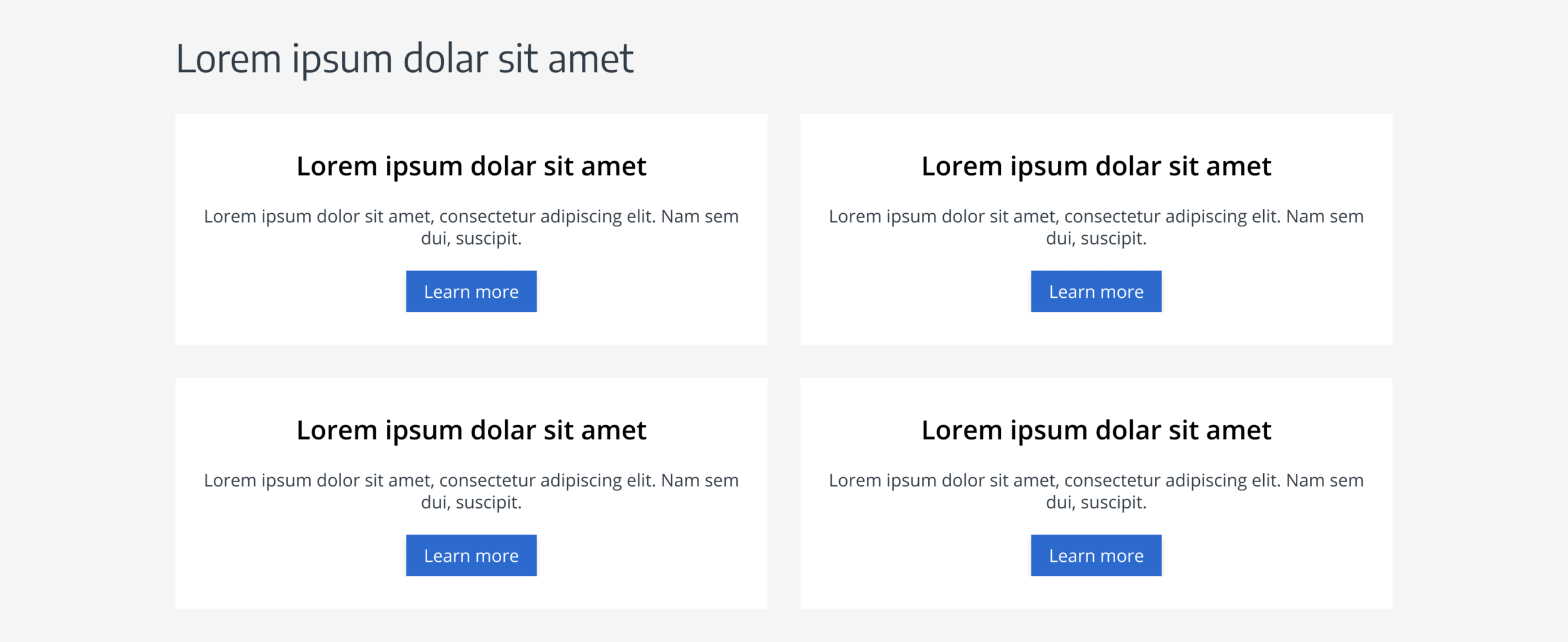
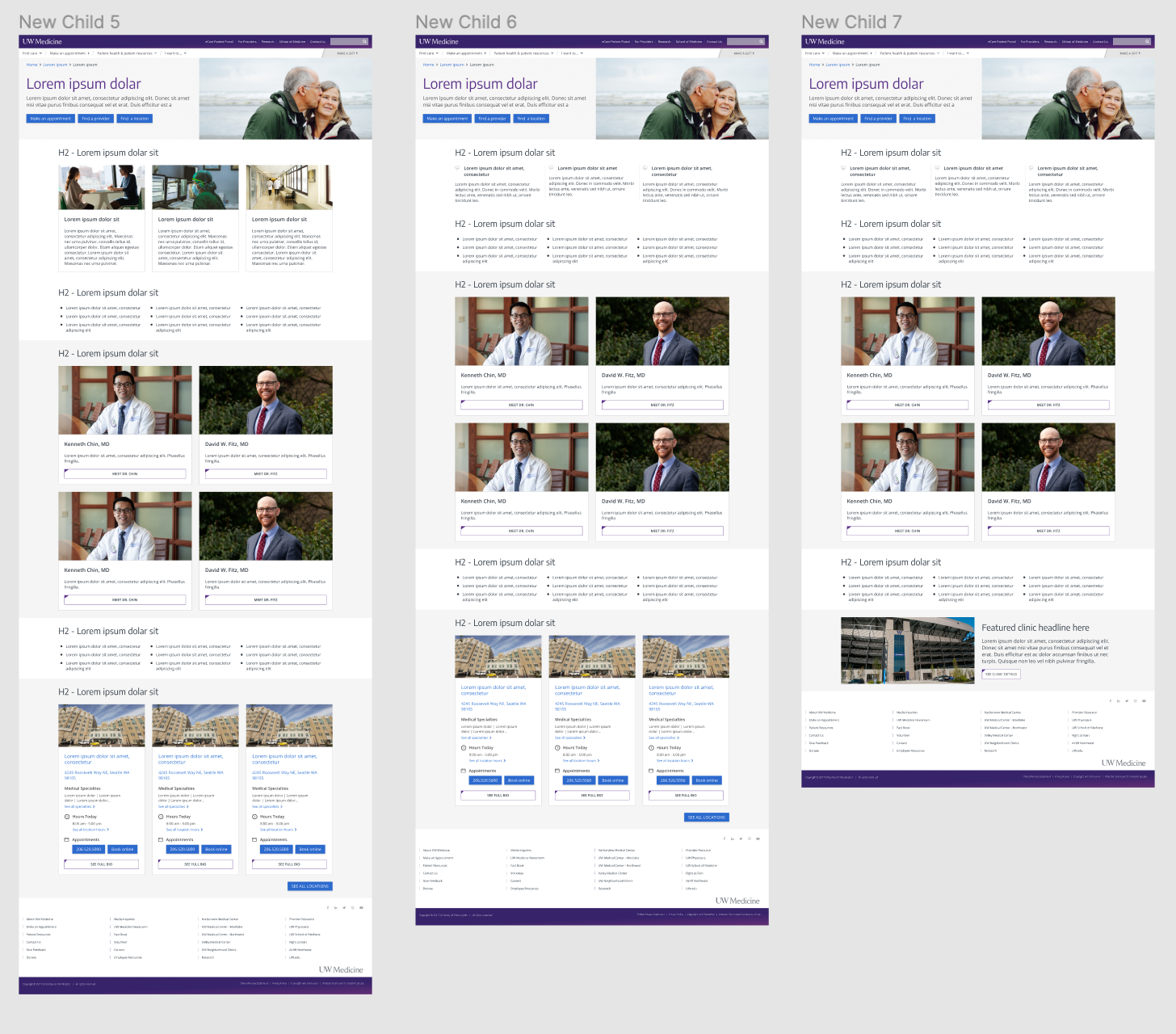
With the launch of the new “Make & manage appointments" page six components will be in introduced to the UWMedicine.org visual infrastructure.
New ways to visualize and present information coupled with a new content management system approach (Drupal’s Layout Builder) would soon present content designers, content strategists and page owner more options and control. This increase in flexibility yielded the question.
“How could page creators reference a single source of knowledge for new components to understand behavior, governance and recommended patterns for usage?”
We needed a tool to realize the potential of guided collaborative design. We needed a way to reduce design time while scaling knowledge. We needed Figma.
Due to the COVID-19 pandemic delaying the launch of the “Make & management appointments” page, I leveraged the additional runway to build out a design system and pattern library within Figma to boost the team’s efficiency and potential to scale our design capability.
Why Figma?
Cleaner designer to developer hand-offs
More efficient content entry in designs compared to tools like Sketch, Adobe XD and others
Lower barrier to entry when creating components for use by others in layouts
Ability to create a single source of digital design truth for component behavior, page patterns and logic documentation
Ability to design and prototype in a single tool
Maximizes efficiency by allowing multiple users to be working in a file at once
Appendix
Competitive user test script
Today you will be answering questions and performing a series of tasks. Please be honest as you share and write your responses. Thank you for your time and perspective!
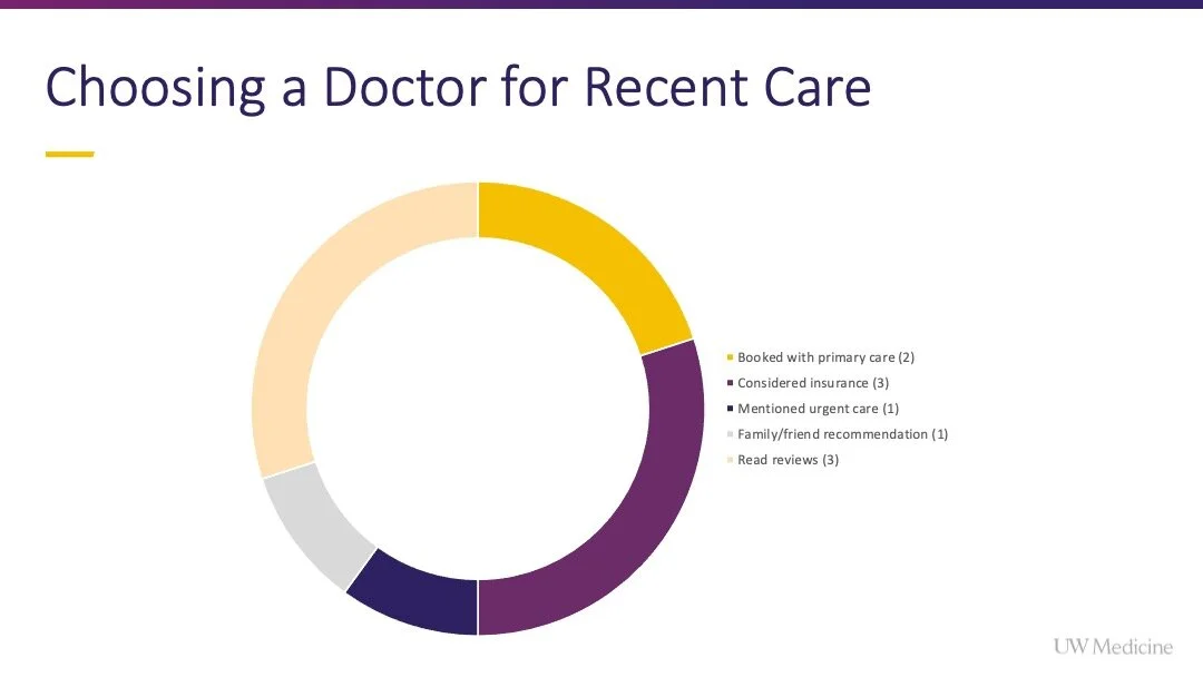
When you suspect that you may be ill and have decided to see a doctor, how do you seek care? [Multiple Choice: Walk-in clinic (within a grocery/drug store), Walk-in urgent care, Emergency room, Scheduling an appointment with my primary care doctor, Scheduling an appointment with the first available doctor, Other: Please speak your response out loud]
When you need to visit the doctor, who generally schedules your appointments? [Multiple Choice: I schedule my appointments, My spouse, My parents, Other: Please speak your response out loud]
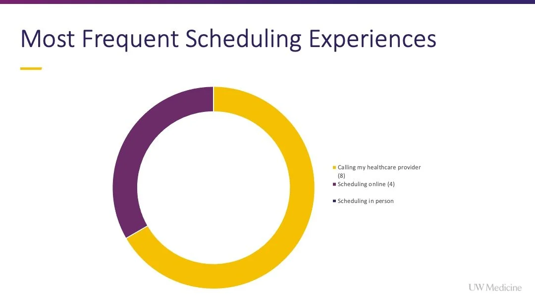
How do you most frequently schedule an appointment? [Multiple Choice: Calling my healthcare provider, Scheduling online, Visiting a care location to schedule in-person, Other: Please speak your response out loud]
Imagine that you are considering changing your primary care doctor and a new healthcare provider begins offering appointments in your area. You visit the website to explore. What would you expect to see on a page called “Appointments”? Please speak your response out loud. [Verbal Response]
What would you expect to be able to do on this page? Please speak your response out loud. [Verbal Response]
How do you expect to be able to schedule an appointment from this page? Please speak your response out loud. [Verbal Response]
Think back to a time when you have needed to visit the doctor. Please detail the scenario. [Written Response]
In the scenario you mentioned, how did you decide which doctor to schedule with? [Written Response]
In the scenario you mentioned, how did you decide which clinic to visit? [Written Response]
Do you usually visit the same location to receive healthcare? [Multiple Choice: Yes, No, Other: Please speak your response out loud]
Launch URL: https://nyulangone.org/
You have been taken to a new page. When you see the page, move on to the next step.
Please schedule an appointment. Proceed only as far as you can before entering personal information. Please speak your thoughts out loud as you complete the task.
What (if anything) was easy/intuitive about the scheduling experience? [Written Response]
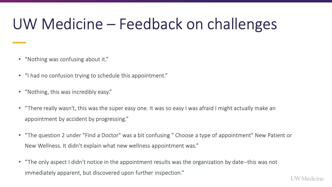
What (if anything) was confusing or challenging about the scheduling experience? [Written Response]
What (if anything) would you change about scheduling an appointment with NYU Langone? [Written Response]
Launch URL: https://www.nm.org/
You have been taken to a new page. When you see the page, move on to the next step.
Please schedule an appointment. Proceed only as far as you can before entering personal information. Please speak your thoughts out loud as you complete the task.
What (if anything) was easy/intuitive about the scheduling experience? [Written Response]
What (if anything) was confusing or challenging about the scheduling experience? [Written Response]
What (if anything) would you change about scheduling an appointment with Northwestern Medicine? [Written Response]
Launch URL: https://www.uwmedicine.org/
You have been taken to a new page. When you see the page, move on to the next step.
Please schedule an appointment. Proceed only as far as you can before entering personal information. Please speak your thoughts out loud as you complete the task.
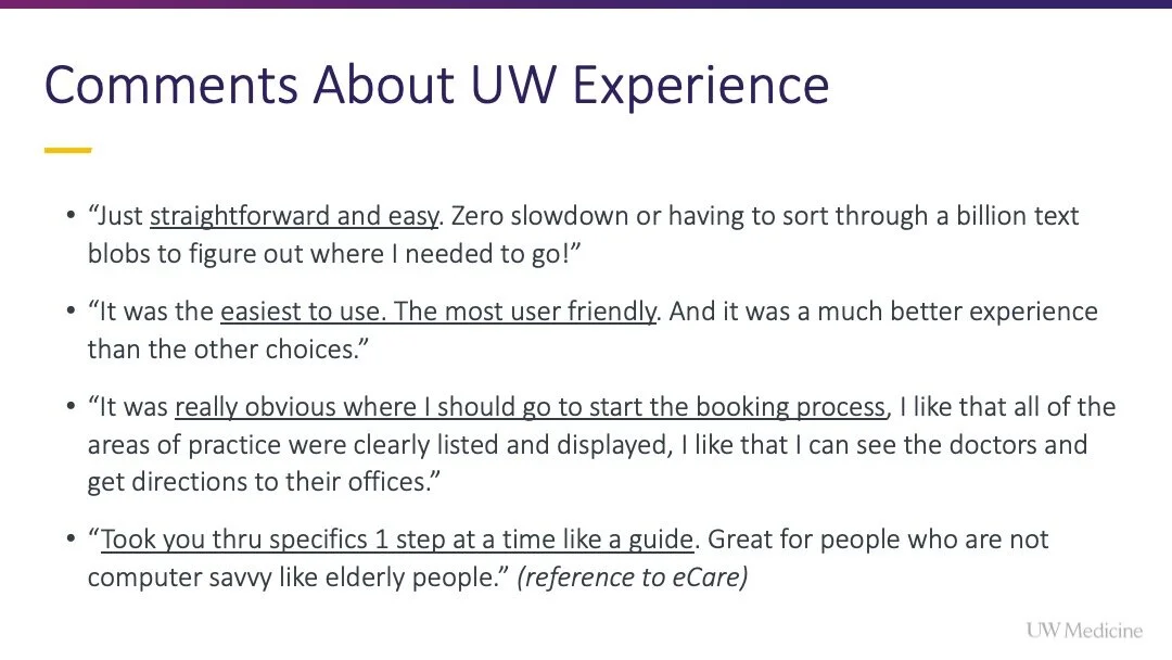
What (if anything) was easy/intuitive about the scheduling experience? [Written Response]
What (if anything) was confusing or challenging about the scheduling experience? [Written Response]
What (if anything) would you change about scheduling an appointment with UW Medicine? [Written Response]
Which scheduling experience did you prefer? [Multiple Choice: NYU Langone, Northwestern Medicine, UW Medicine]
Please explain why you preferred this scheduling experience? [Written Response]
What (if anything) was missing from the scheduling experiences? [Written Response]
Are there any other observations you would like to share? [Written Response]
