
UW Medicine | Appointing Action Prominence on Location Pages
Business Goal
UW Medicine wants to continually increase appointment bookings made through the website.
Context
Clinic pages are popular landing pages on the website for patients. Additionally, in an original survey released through NRC Health to a panel of 100 respondents in the King County area, I found that distance from home or work was the second most important selection criteria for patients when choosing a healthcare provider. (The most important selection criteria was insurance coverage.) Thus, we know these pages are important to patients when credentialing a healthcare provider and choosing a clinic location once a health provider selection has been made.

Hypothesis
If we increase prominence of the appointment booking actions, then click-through rate on clinic pages will improve because patients will find the action more easily.
User Story
As a potential, new or returning patient of UW Medicine, I would like to easily book an appointment at the location of my choosing.
My Impact
I served as the sole user interface designer tasked with visualizing the more prominent appointing actions. Also, as the sole user experience designer on the project, I mapped the available user paths and collaborated closely with the engineering team to integrate as tightly as possible with the appointing interface managed on a separate website by a different team.
Process
Map the appointing paths
Phone call for new/returning patients
Online scheduling for new patients
Online scheduling for returning patients
Iterative design reviews
I presented my work at the weekly visual design review and also at our Agile sprint grooming session to discuss feasibility and acceptance criteria for the UX/UI feature enhancement.
A/B Testing
To validate our hypothesis that a more prominent call-to-action would increase click-through, we A/B tested the current experience against the proposed. I collaborated with a front-end developer to build the test in the Google Optimize testing platform.
Online booking – The new UX had a significant impact on user engagement resulting in a 800% change in click-through on desktop and 1,140% change in click-through on mobile. (How did we measure this if the proposed online booking functionality was new? We compared against the previous “Make an Appointment” link.
Phone – The new UX had mixed results. On a test for one clinic type (specialty care), we saw an increase on mobile click-through. On a test for a primary care clinic, we saw a 700% increase on desktop and no change on mobile. This indicates that the current phone number text is somewhat discoverable for patients, and that a button boosts conversion in some cases. If a button visual aligns with book online UI, then implementing this will not hurt engagement.
Responsibilities
Wireframing
High-fidelity UI design
Participation in all Agile ceremonies as an embedded member of the development team
UX/UI review before code release
The screens were designed in Adobe XD.
Key UX/UI Improvements Made
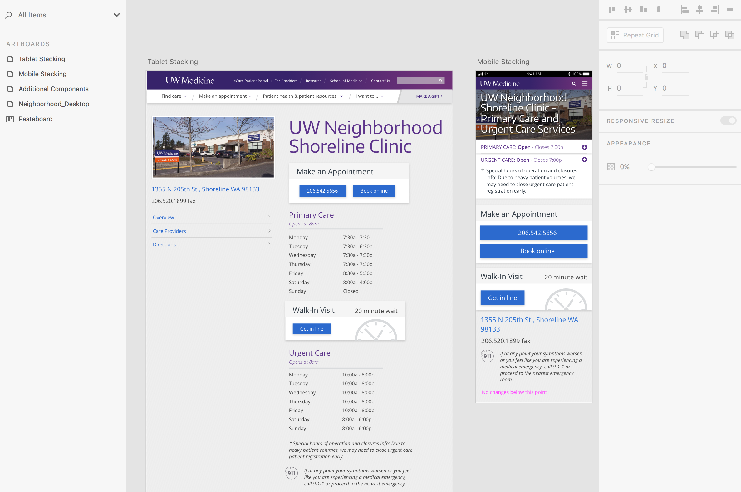
Previously, the sole appointing action “Make an Appointment” was represented under the image of the clinic within the left rail of the page. It was bounded by two faint lines and was not a prominent visual element on the page.
Additionally, clicking the link took users to a generic make an appointment page. I knew that I wanted to reduce the click cost and represent the key appointing paths on each location page without asking users to click to view all their options.
UX/UI Challenges
The structure and organization of the online appointment scheduling interface was a barrier. Returning patients who sign in to the interface move through a markedly better experience than first-time patients or guests. Additionally, more providers and locations are “enabled” for returning patients than for first-time patients. Returning patients who sign in can select a provider they have seen or location they have visited before. To make the most of this improved pathway in the experience, I knew I wanted to create a component that specifically appealed to returning patients.
UX/UI Goals
How can I make the appointing actions a more prominent element within the interface?
How can I represent all available appointing paths on the location page?
Specialty Clinic Page Before & After Redesign
Before

After

On the four urgent care clinics, the returning patients module was replaced with a module that allows users to virtually “get in line” thereby reserving their place. The module also featured the wait time. (This was an existing pathway that was restyled.)


